How to resize the device in Blisk
Discover the easiest way to resize your device and enjoy seamless browsing on any screen size.
Notice:
This article is out of date. We are updating the documentation.
Review the latest documentation for Blisk
This article is out of date. We are updating the documentation.
Review the latest documentation for Blisk
Blisk browser layout is responsive. It means that you can resize the width of the web content and the device content.
If you need to resize the width of web content or the device content - simply drag the gray splitter, which is located between the web and device content.
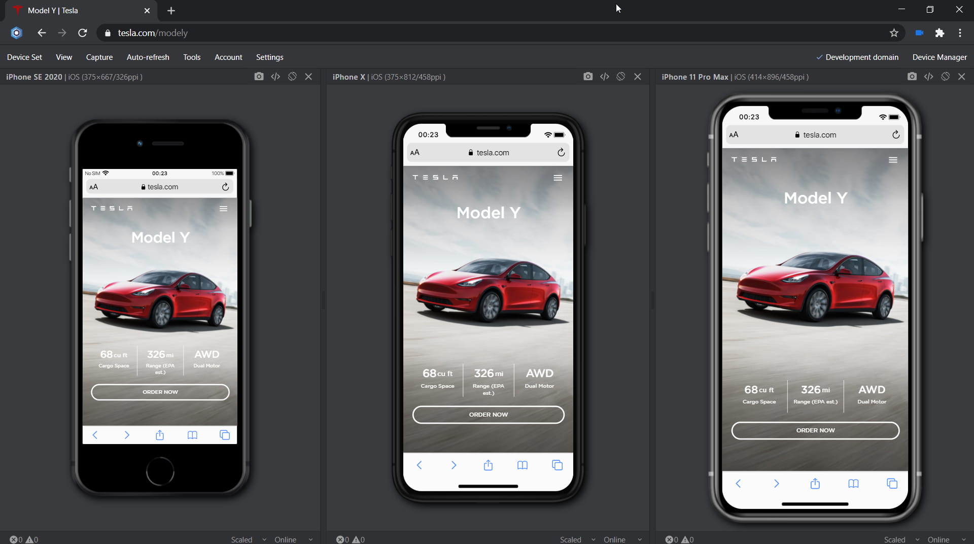
Splitter in Blisk browser
Note, that Blisk browser saves the widths of the web and mobile content. If you resize these contents and open the new tab or the new window - the sizes of these contents will be the same as you have changed before.
Related questions:
- What is Blisk device
- Blisk devices list disappeared
- Phones list disappeared
- Tablets list disappeared
- Which device am I using
You can subscribe to our news and updates by leaving your Email in the footer or by following us on Twitter.
Learn the basics of using Blisk:
Learn more about Developer Mode, Development Domain, and Device Manager on Blisk Documentation.
Article tags:
GeneralBliskbrowser