
Mobile-Friendly Test with Blisk
With Blisk, you can run different types of tests for mobile and desktop that you have never done before
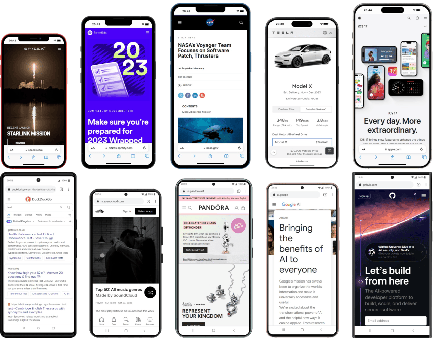
Some of the tests available in Blisk:
Develop and test for mobile and desktop simultaneously
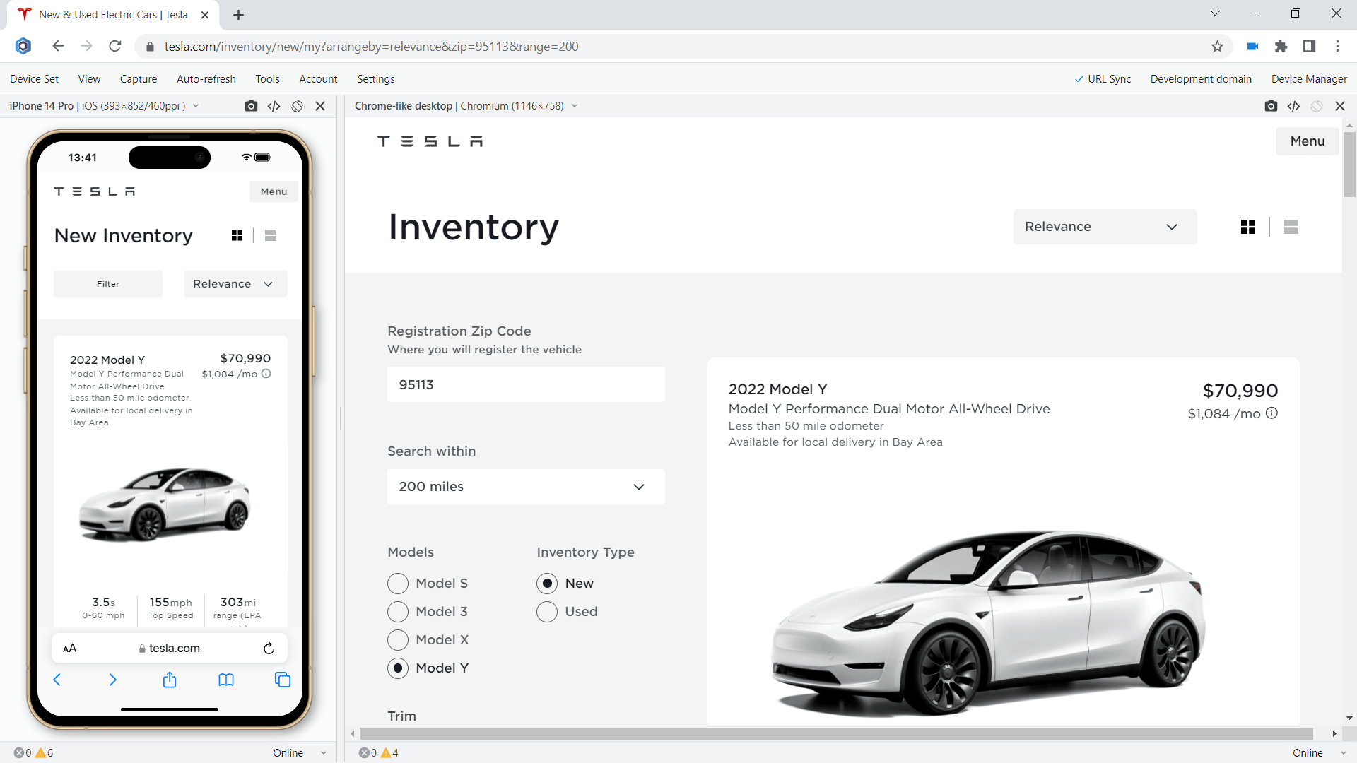
More than 50 devices are integrated into Blisk. The devices are divided into three main groups: mobile phones, tablets, laptops and desktops. You can use any device separately or multiple simultaneously by creating different combinations of devices:
- Mobile phones (e.g. iPhone 13 Mini + iPhone 15 Pro Max).
- Mobile phone and Tablet (e.g. iPhone 15 Pro + iPad 10-inch).
- Mobile and Laptop. For example: iPhone SE + Macbook Air.
- Run a test on Mobile and Responsive view called Chrome-like view.
The mobile phones are powered by iOS and Android operating systems. iPhones as the most demanded devices are available of all versions: from small iPhone 5s and up to the latest iPhone 15 series. The majority of mobile phones for testing come from three main vendors: Apple, Google, and Samsung. See the list of devices and their specification on Device Portal.
Touch events testing
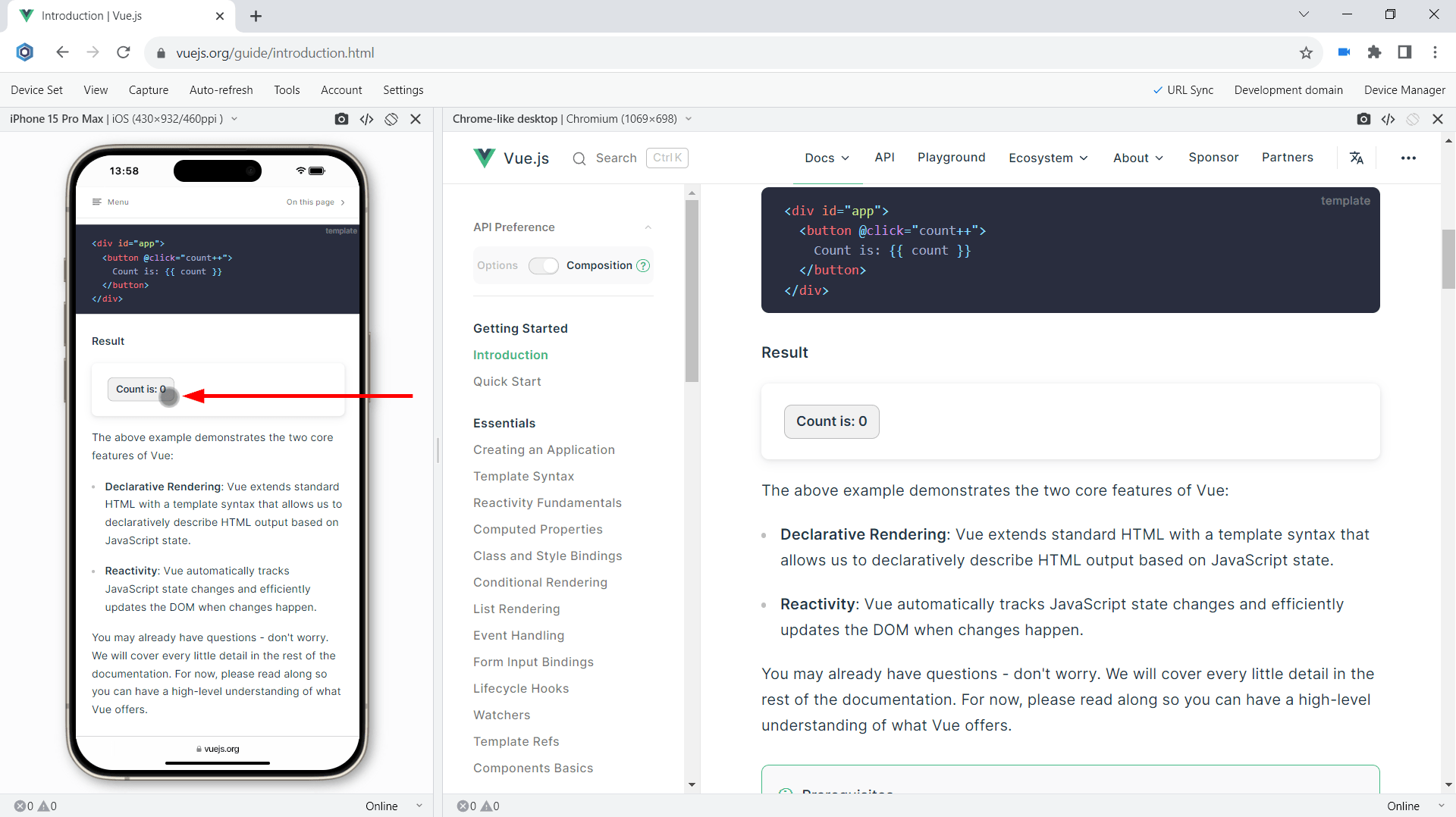
The support for Touch events is one of the key requirements when you develop web applications for mobile devices. All modern mobile devices have touch screens that use touch or stylus as the only way of interaction. Gestures like Swipe is another key point to consider when testing on mobile. Your users may need to use swipe on different places: opening a Menu, viewing photos in a Slider, etc.
All mobile phones and tablets in Blisk support touch events and gestures natively therefore you can test them easily without the need to have a mobile device. In addition, you can use Developer Tools on each device separately to track touchstart, touchend, touchcancel, or touchmove.
Mobile test of reactive single-page applications
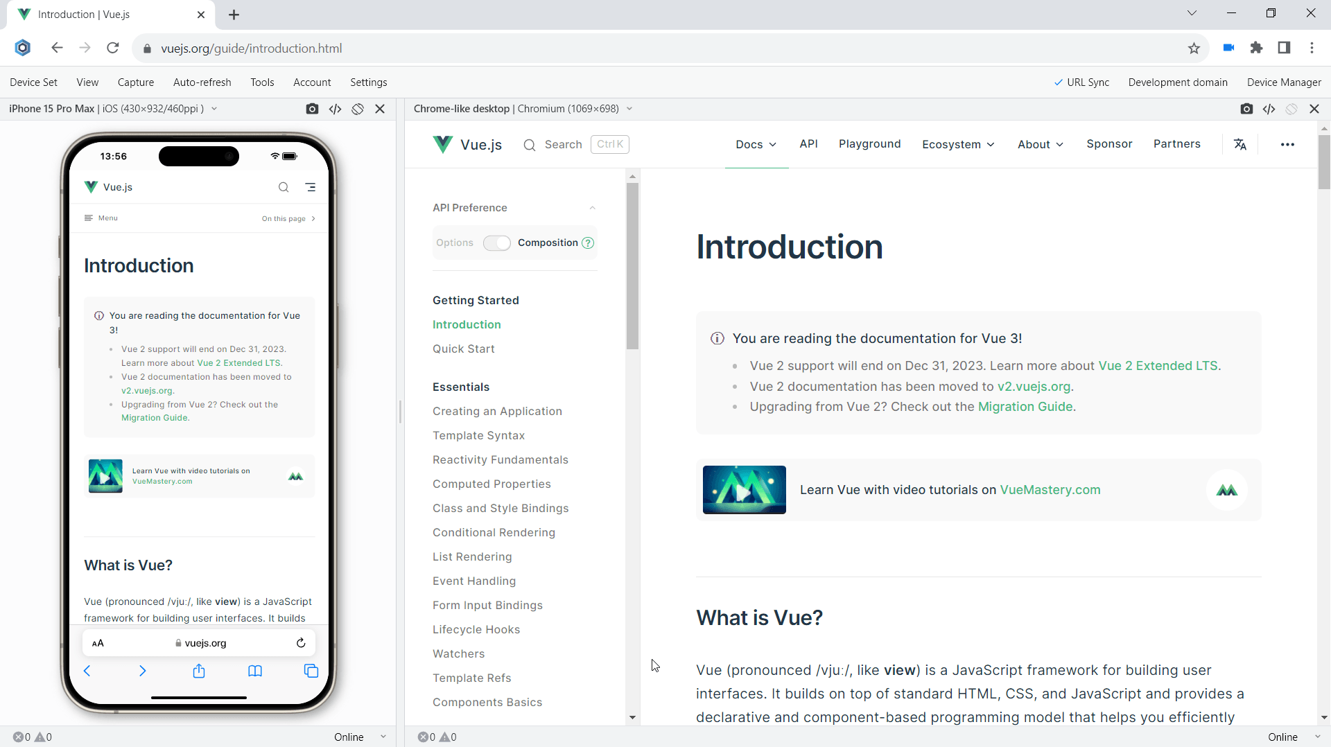
Within the last five years, the market of single-page application has grown significantly with the release and updates of such frameworks like Angular, React, Meteor, Ember, Backbone, and VueJS. The modern single-page applications create enhanced user experiences. But when it comes to mobile tests, SPAs require additional efforts. Blisk natively supports single-page applications on mobile and desktop.
When you use multi-device mode (like mobile and desktop at the same time), Blisk handles custom navigation for single-page apps on both devices by synchronizing navigations back and forth. Whenever you navigate to some URL on one device, other devices follow as well.
Mobile test on slow Internet connection
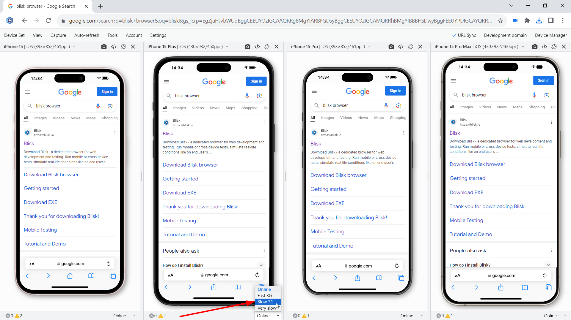
With the advent of the mobile Internet era, your users can now be virtually anywhere and use your web app from home to the furthest desert island. Application load time has become one of the most important factors in building a successful online business.
Have you ever wondered how quickly your application responds to user input on a slow connection? In Blisk, you can simulate different types of internet connection speed: WIFI, 2G, 3G, 4G. Blisk's slow 3G setting will help you run a custom mobile test and find the resources consuming all the bandwidth on your end user's device. In addition, you can adjust the network speed on each device differently and compare the results across a set of devices.
Mobile test on device in real size
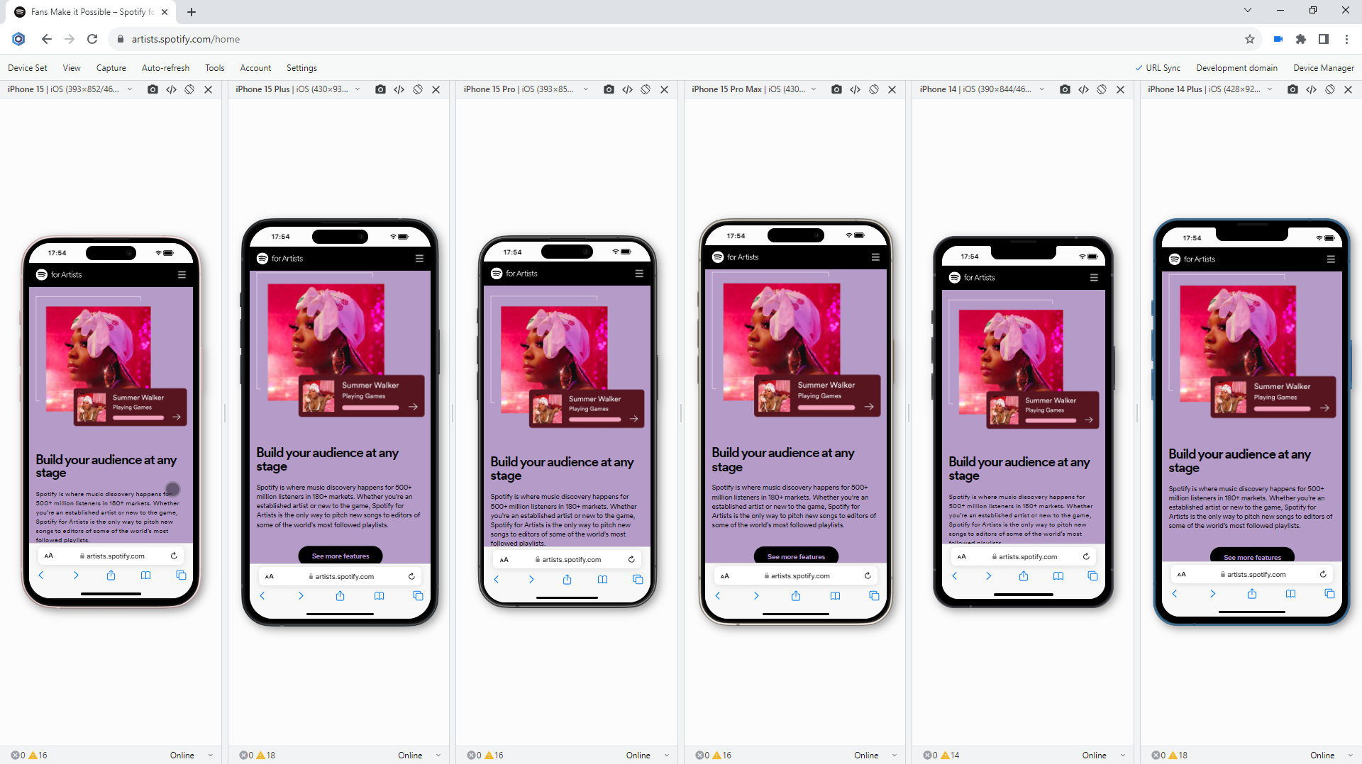
Have you ever wondered that development at a large, unrealistic scale is misleading you as to how user-friendly a web application will be for the end user? When you're at a larger size, everything from text and images to icons and buttons can give the impression of a complete, user-friendly web application. But when the end user tries to use your web app on a real device, the user flow is broken. Your app may even suffer from one too small Register button that your user can't click.
Blisk is optimized for different screens and monitors and lets you display mobile devices in different sizes including real size.
- Relative size displays phones in relative size to each other.
- Scaled size (default) displays devices in maximum width and height (best for small laptops).
- With the Real Size option, Blisk displays phones and tablets as if you were holding them in your hands. The Real Size option is the best choice for mobile testing providing you the look and feel of a web application same as on a device of your end user.
Mobile test in portrait and landscape
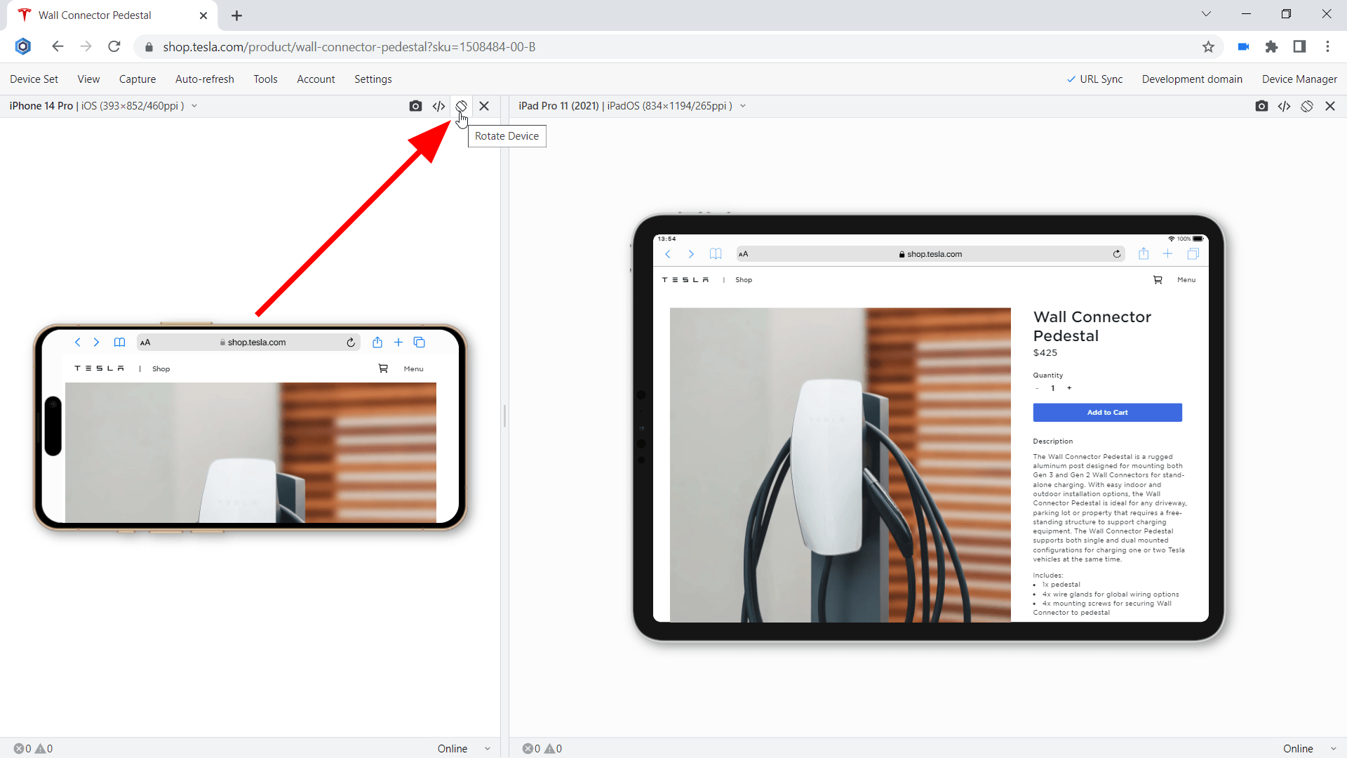
Unlike desktops and laptops, mobile phones and tablets offer the opportunity to switch the orientation from portrait to landscape and vice versa. Despite the fact that portrait and landscape orientations differ only in that the viewport is rotated 90 degrees, their differences in size are significant. Usually, this difference is overlooked but causes issues for your users on mobile.
Ever wondered what does @media (orientation:landscape) { … } do? Mobiles and Tablets in Blisk have an option to change the orientation with just one click providing the users with a clear vision of what happens on mobile phones of the end users.
Specific behaviors for landscape orientation have become popular and are used more and more. This creates challenges for developers and QA engineers.
Mobile test in dark mode
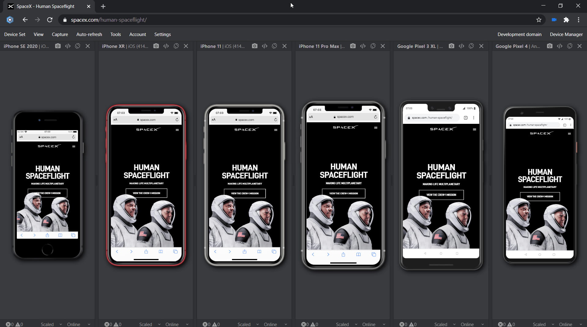
With the release of the prefers-color-scheme meta tag, developers have the opportunity to apply their own styles depending on the user's color scheme: light or dark. Since then, implementing dark mode for web applications has become the standard. Most web browsers, including iOS, Android, iPadOS, and desktops, have already implemented this feature and offer dark mode.
Blisk also natively supports dark mode. This means you can detect if dark mode is enabled from CSS or JavaScript and trigger custom styles or layouts. What opportunities does this feature open to you? By enabling dark mode in Blisk, you can simulate dark mode on a mobile device. Some mobile users prefer to turn on dark mode at night. So now you can check if the UI works well under night lighting and check the contrast.
Mobile test for webpage errors
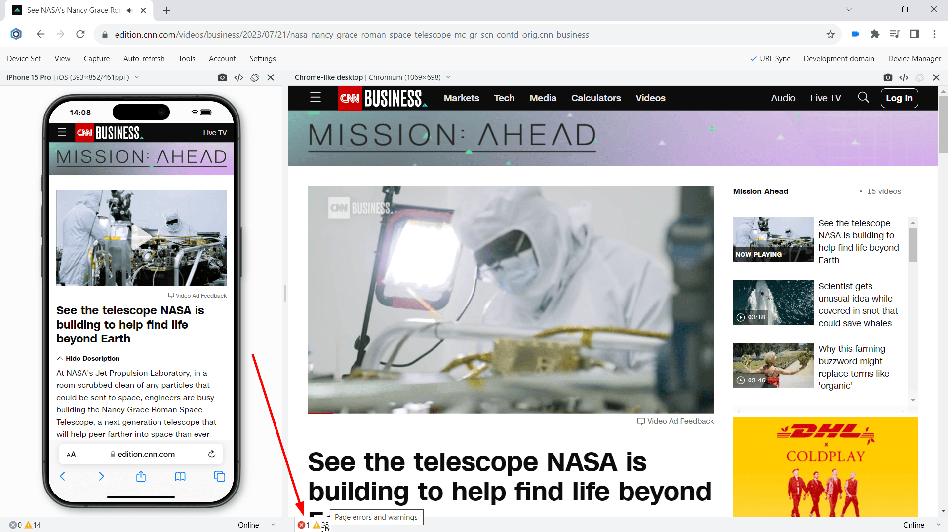
Error monitoring is one of the most overlooked key points in web development and testing. The problem is that web developers and QA engineers have to work with the open console tab. Non-professionals or newbies in web development often do not know about console errors at all or do not pay enough attention to this problem.
Blisk solves this problem by providing a built-in error-monitoring system that continuously monitors web page errors and notifies the user every time a problem occurs. Blisk tracks JavaScript page errors and resources that failed to load in real time. It is important to note that some errors may occur on a specific device (for example, some image formats may not be supported on the iPhone, but will be supported on the desktop). Blisk handles this by tracking each device independently. Blisk shows separate lists of errors that occurred on the iPhone and on the desktop.
Thanks to the error-monitoring system, you will notice the error as soon as you execute the code. As a result, Blisk helps to detect issues at the early development stage and keeps the production environment clean and working properly.
Testing Emails on mobile
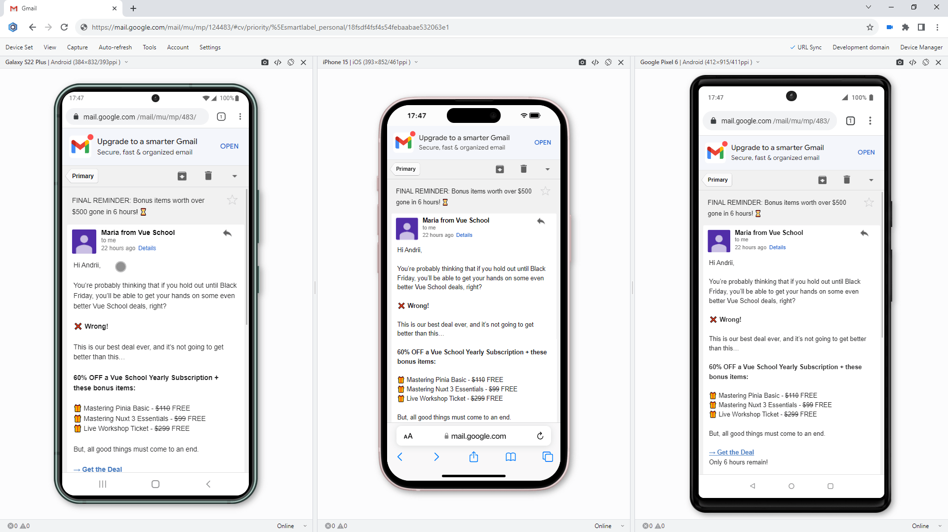
Email is one of the most common ways of communicating with your users. Ever wondered, how your Emails look and feel on the real Mobile devices of your users? With Blisk, developers can create mobile-friendly Emails, QA engineers can test the Emails on devices of any type - mobile, tablet, and desktop.
With Blisk, you can test your Emails in Gmail, Outlook, or any other Email service. To run this test, start a device set with any Mobile or Tablet, navigate to Gmail or Outlook, and test the emails that you send to your end users.