Published on Wednesday, Jan 22, 2025
Author: Blisk team
Author: Blisk team
Blisk release 24.0.411.33
Mobile test on iPhone 16 series, Galaxy S23-S24 series with the latest technologies support.
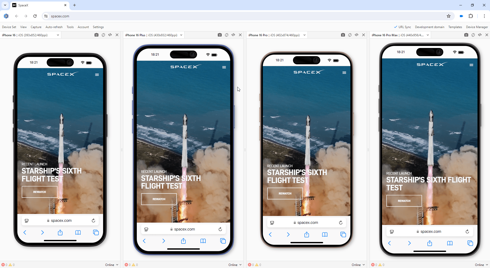
We are excited to release the new features: Mobile test on iPhone 16, iPhone 16 Plus, iPhone 16 Pro, iPhone 16 Pro Max, Galaxy S23, Galaxy S23 Plus, Galaxy S23 Ultra, Galaxy S24, Galaxy S24 Plus, and Galaxy S24 Ultra.
Notice:
Blisk v.22 was the last to support macOS High Sierra and Mojave. The users on macOS High Sierra and Mojave will no longer receive updates from Blisk. Update your macOS to a newer version (10.15 or more) to receive this update. Learn more...
Blisk v.22 was the last to support macOS High Sierra and Mojave. The users on macOS High Sierra and Mojave will no longer receive updates from Blisk. Update your macOS to a newer version (10.15 or more) to receive this update. Learn more...
New devices in Blisk
iPhone 16, iPhone 16 Plus, iPhone 16 Pro, iPhone 16 Pro Max, Galaxy S23, Galaxy S23 Plus, Galaxy S23 Ultra, Galaxy S24, Galaxy S24 Plus, and Galaxy S24 Ultra are ready to use in the Blisk app, where you can run a mobile test, responsive test, or cross-device test. These devices are preinstalled in the Blisk app, so you don't need to download or install anything other than the Blisk app. The latest Androids run directly on your PC, Mac, or Linux, and the code runs locally, avoiding potential data loss or security issues.
Requirements: this feature is available in Blisk v.24.0.411.33 and later. You may need to update the Blisk application to use this feature. How to update Blisk...
Starting with v.24.0.411.33, Blisk opens new possibilities for running different kinds of mobile tests (: responsive test, multi-device test, touch events test, performance test, landscape orientation test, dark mode test, test for page errors, slow Internet connection test, etc.):
- iOS devices: iPhone 16, iPhone 16 Plus, iPhone 16 Pro, and iPhone 16 Pro Max.
- Android devices: Galaxy S23, Galaxy S23 Plus, Galaxy S23 Ultra, Galaxy S24, Galaxy S24 Plus, and Galaxy S24 Ultra.
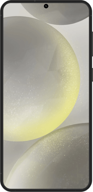
iPhone 16 has a 6.1-inch screen with 1179px × 2556px resolution, 393px × 852px viewport, and CSS Pixel Ratio of 3.
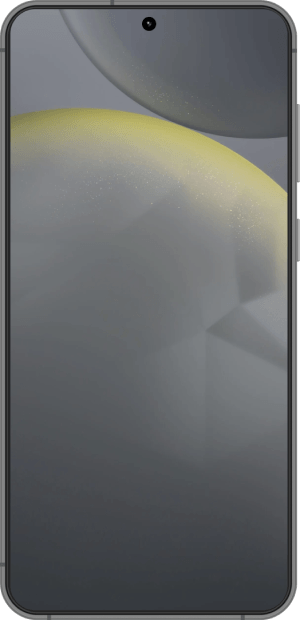
iPhone 16 Plus has a 6.7-inch screen with 1290px × 2796px resolution, 430px × 932px viewport, and CSS Pixel Ratio of 3.
iPhone 16 Pro has a 6.3-inch screen with 1206px × 2622px resolution, 402px × 974px viewport, and CSS Pixel Ratio of 3.
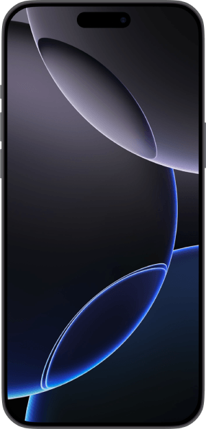
iPhone 16 Pro Max has a 6.9-inch screen with 1320px × 2868px resolution, 440px × 956px viewport, and CSS Pixel Ratio of 3.
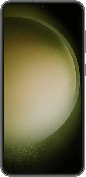
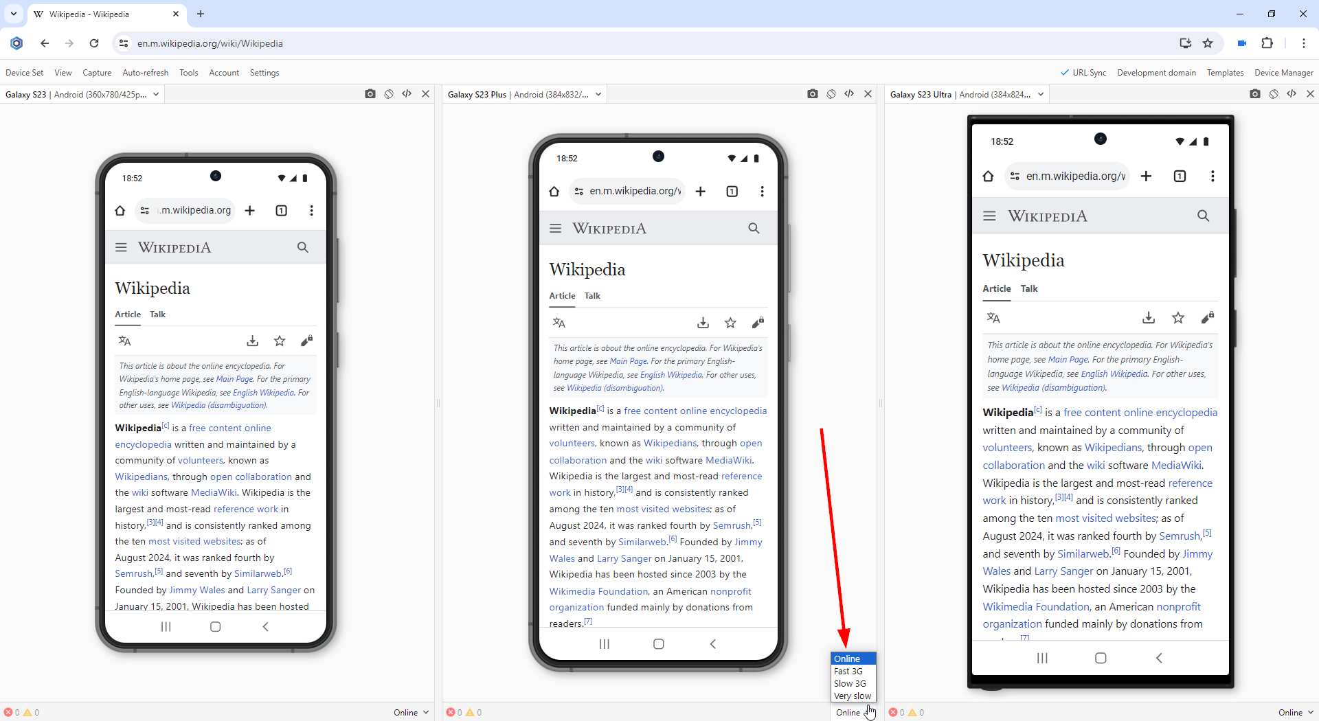
Galaxy S23 has a 6.1-inch screen with 1080px × 2340px resolution, 360px × 780px viewport, and CSS Pixel Ratio of 3.
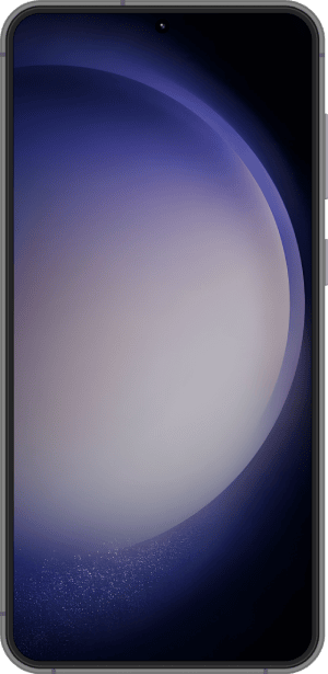
Galaxy S23 Plus has a 6.6-inch screen with 1080px × 2340px resolution, 384px × 832px viewport, and CSS Pixel Ratio of 2.8125.
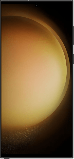
Galaxy S23 Ultra has a 6.8-inch screen with 1440px × 3088px resolution, 384px × 824px viewport, and CSS Pixel Ratio of 3.75.
Galaxy S24 has a 6.2-inch screen with 1080px × 2340px resolution, 360px × 780px viewport, and CSS Pixel Ratio of 3.
Galaxy S24 Plus has a 6.7-inch screen with 1440px × 3120px resolution, 384px × 832px viewport, and CSS Pixel Ratio of 2.8125.

Galaxy S24 Ultra has a 6.8-inch screen with 1440px × 3120px resolution, 384px × 824px viewport, and CSS Pixel Ratio of 3.75.
iPhone 16 series: screen size, viewport, pixel ratio, CSS media query, and specification
The specifications, viewport size, screen size, pixels per inch (PPI), and CSS Pixel Ratio for new devices are available on the Device portal, where you can find the device metrics for all devices including the latest iPhone 16 or Galaxy S23-S24 series:
- iPhone 16 viewport, resolution, and specs
- iPhone 16 Plus viewport, resolution, and specs
- iPhone 16 Pro viewport, resolution, and specs
- iPhone 16 Pro Max viewport, resolution, and specs
Galaxy S23-S24 series: screen size, viewport, pixel ratio, CSS media query, and specification
The specifications, viewport size, screen size, pixels per inch (PPI), and CSS Pixel Ratio for new devices are available on the Device portal, where you can find the device metrics for all devices including the latest iPhone 16 or Galaxy S23-S24 series:
- Galaxy S23 viewport, resolution, and specs
- Galaxy S23 Plus viewport, resolution, and specs
- Galaxy S23 Ultra viewport, resolution, and specs
- Galaxy S24 viewport, resolution, and specs
- Galaxy S24 Plus viewport, resolution, and specs
- Galaxy S24 Ultra viewport, resolution, and specs
How to run a mobile test on iPhone 16 series and Galaxy S23-S24 series:
- Download Blisk or update to the latest version.
- Launch the Developer Mode from the Toolbar (screenshot below).
- Click Device Manager (screenshot below).
- Select iPhone 16 / iPhone 16 Plus / iPhone 16 Pro / iPhone 16 Pro Max / Galaxy S23 / Galaxy S23 Plus / Galaxy S23 Ultra / Galaxy S24 / Galaxy S24 Plus / Galaxy S24 Ultra from the list.
- Click Launch Devices.
What mobile tests you can run on iPhone 16 or Galaxy S23-S24 series in Blisk:
Responsive test:
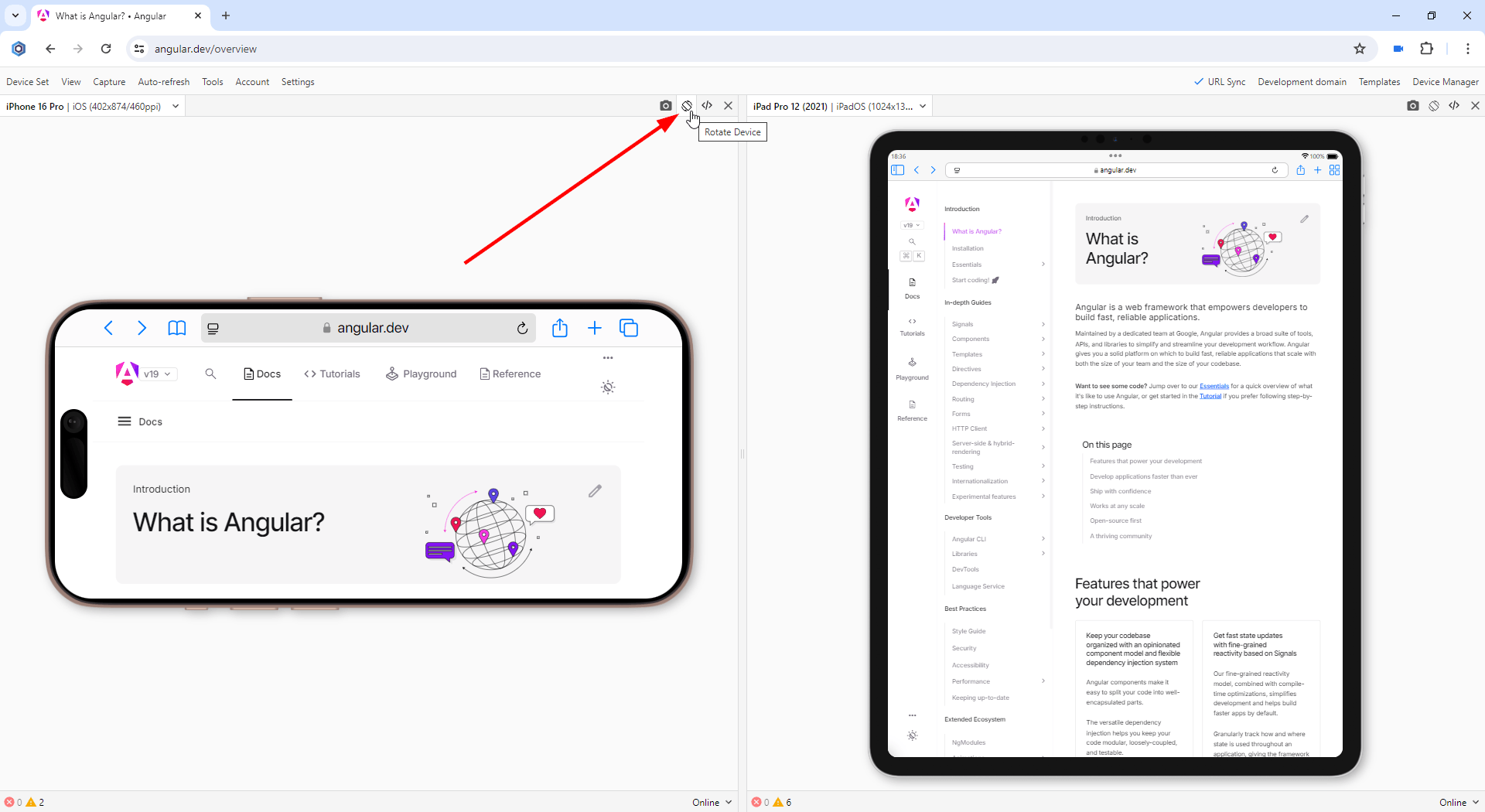
You can evaluate the capability of your website to support responsive design and ensure it appears visually appealing on the most recent Apple and Samsung mobile devices. Conducting this mobile assessment will help identify any problems related to the responsive layout and user experience on mobile platforms. You can now test the responsive design on devices such as the iPhone 16, iPhone 16 Plus, iPhone 16 Pro, iPhone 16 Pro Max, Galaxy S23, Galaxy S23 Plus, Galaxy S23 Ultra, Galaxy S24, Galaxy S24 Plus, and Galaxy S24 Ultra, and compare the layout with that of laptops, desktops, and iPads.
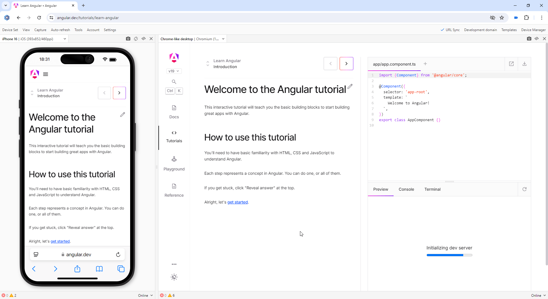
Responsive test on iPhone 16 and Chrome-like desktop
Multi-device test:
You can test on iPhone 16 or Galaxy S23-S24 series or use them with other devices such as other Android or iOS mobile phones, iPadOS tablets, Windows and macOS laptops, and desktops. When you use mobile and desktop at the same time, you are running mobile and desktop tests simultaneously. It becomes much easier to compare devices side-by-side. Starting with version 19.1, you can test iPhone 16, iPhone 16 Plus, iPhone 16 Pro, iPhone 16 Pro Max, Galaxy S23, Galaxy S23 Plus, Galaxy S23 Ultra, Galaxy S24, Galaxy S24 Plus, and Galaxy S24 Ultra simultaneously with other devices.
Multi-device test on iPhone 16 or Galaxy S23-S24 series
Touch events test:
You can check if your website supports touch events and gestures on the iPhone 16 or Galaxy S23-S24 series. Touch is a key element in any mobile test because all interactions on mobile are done using touch. Blisk offers built-in compatibility with touch events and gestures support on all new devices, enabling convenient testing and eliminating the need for an actual mobile device. In addition, you can use Developer Tools on each device separately to track touchstart, touchend, touchcancel, or touchmove.
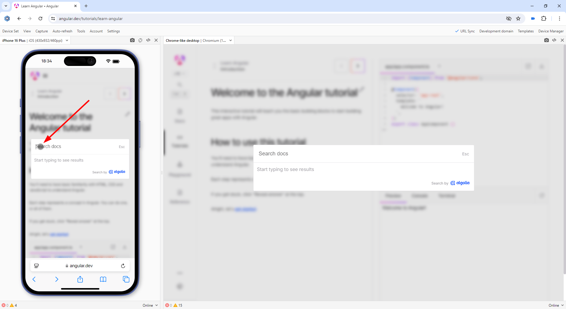
Touch events test on iPhone 16 or Galaxy S23-S24 series
Landscape orientation test:
You can test how your website behaves in landscape mode on the latest iOS and Android devices. Landscape orientation helps to find issues with layout and user experience. New devices have an option to change the orientation with just one click providing the users with a clear vision of what happens on the mobile phones of the end users. Although portrait and landscape orientations differ only in that the viewport is rotated 90 degrees, their differences in size are significant. Usually, this difference is overlooked but causes issues for your users on mobile.
Landscape orientation test on iPhone 16 or Galaxy S23-S24 series
Developer Tools:
Utilize Developer Tools to test and troubleshoot your website across various devices. Blisk allows you to access Developer Tools on a per-device level with simultaneous usage of DevTools on multiple Apple and Samsung devices such as iPhone 16, iPhone 16 Plus, iPhone 16 Pro, iPhone 16 Pro Max, Galaxy S23, Galaxy S23 Plus, Galaxy S23 Ultra, Galaxy S24, Galaxy S24 Plus, and Galaxy S24 Ultra. These tools enable you to inspect webpage elements, identify errors, monitor network requests, and resolve other development-related problems.
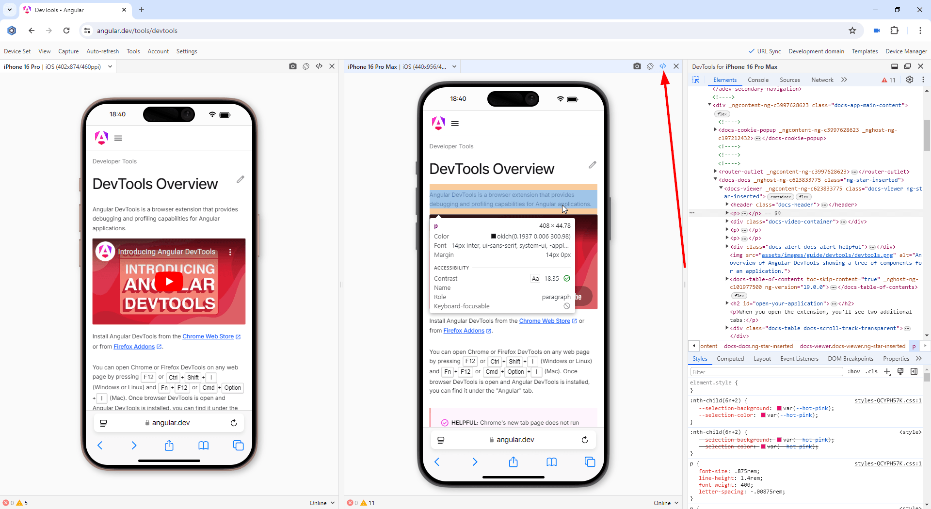
Using Developer Tools on iPhone 16 or Galaxy S23-S24 series
Test for webpage errors:
Monitor for webpage errors that appear on the latest iOSs and Androids and fix the issues before they become critical. The errors on mobile devices may be different from errors on desktops. You can track in real-time JavaScript page errors and resources that failed to load on iPhone 16, iPhone 16 Plus, iPhone 16 Pro, iPhone 16 Pro Max, Galaxy S23, Galaxy S23 Plus, Galaxy S23 Ultra, Galaxy S24, Galaxy S24 Plus, and Galaxy S24 Ultra.
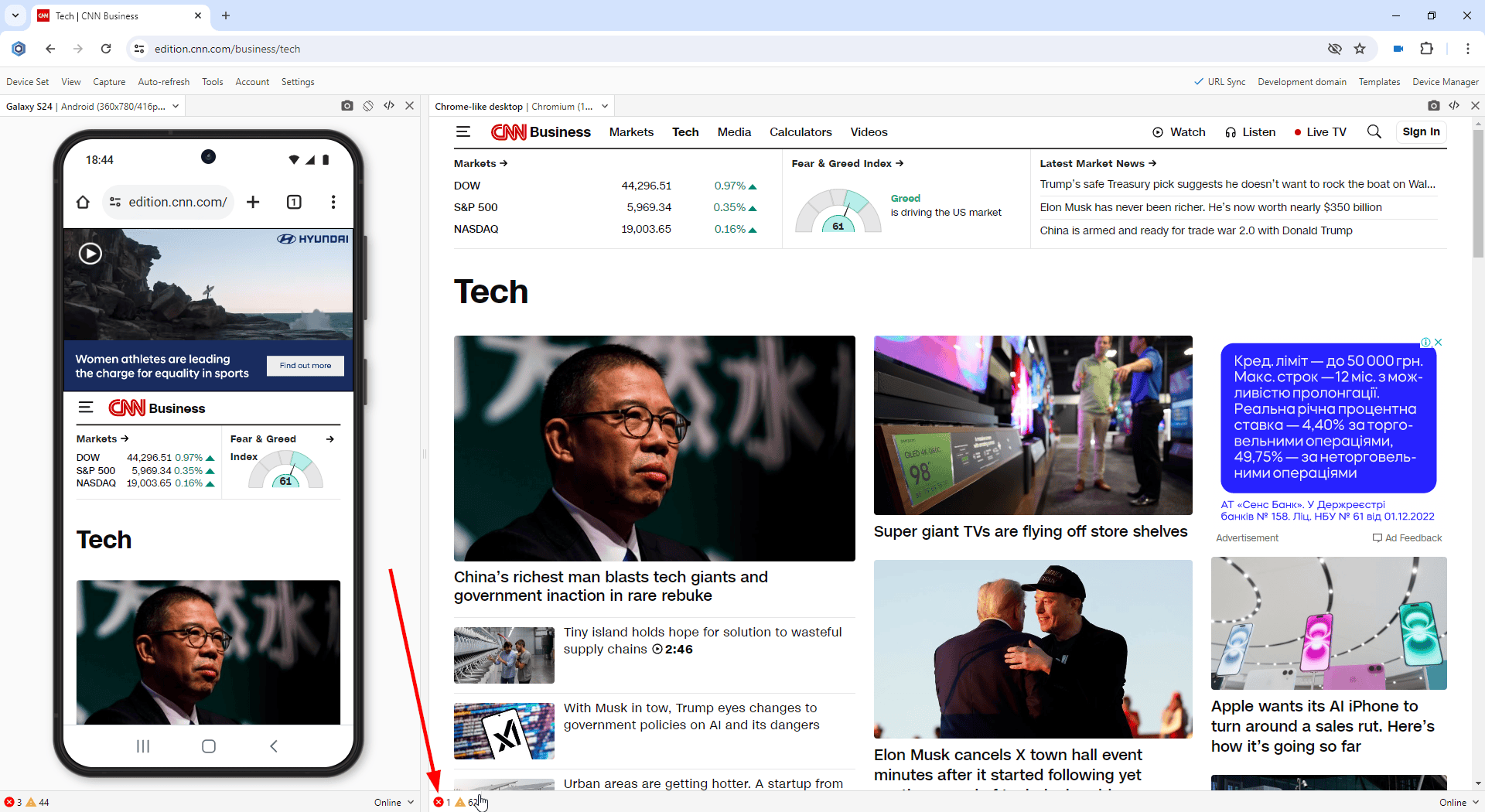
Test for webpage errors on iPhone 16 or Galaxy S23-S24 series
Performance test:
Run mobile tests in terms of webpage speed and performance. Webpage speed is critical on mobile, low speed leads to loss of users. Use the Network tab in the Developer Tools to conduct this important mobile test. This test is now available for the latest iPhone 16 or Galaxy S23-S24 series.
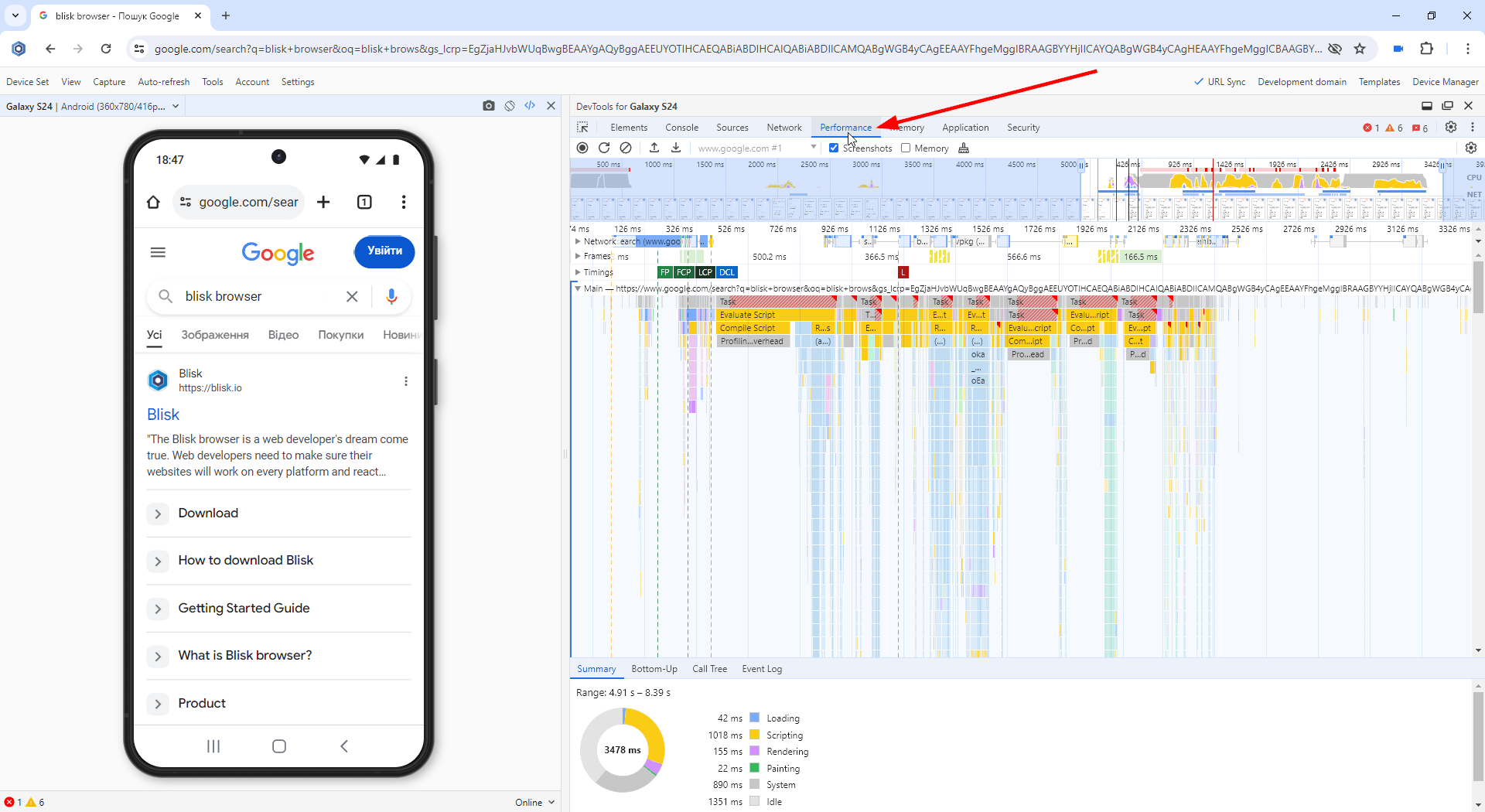
Performance test on iPhone 16 or Galaxy S23-S24 series
Dark mode test:
Check whether your website supports the dark mode on brand-new Androids by running Blisk in dark mode. A lot of mobile users prefer using dark mode at nighttime. That is why the support for dark mode has become a must-have for modern applications. By enabling dark mode in Blisk, you can simulate dark mode on the latest flagships from Google, check if the UI works well under night lighting, and check the contrast.
Slow connection test:
Simulate various real-life scenarios on modern Android devices, like a sluggish internet connection. Blisk allows for the simulation of 2G, 3G, and 4G mobile networks with varying Internet speeds. The Slow 3G setting will help you run a custom mobile test and find the resources consuming all the bandwidth on the iPhone 16 or Galaxy S23-S24 series. In addition, you can adjust the network speed on each latest iPhone 16 or Galaxy S23-S24 devices differently and compare the results across a set of devices.
Slow connection test on iPhone 16 or Galaxy S23-S24 series
Usability test:
Test the user experience on mobile devices, uncover problems in the design, discover opportunities to improve the design, and learn about users' behavior and preferences.
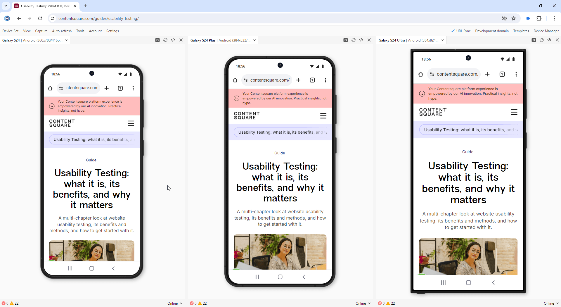
Usability test on iPhone 16 or Galaxy S23-S24 series
Test with your teammates:
You can share device sets with the latest iPhone 16 or Galaxy S23-S24 series via the Blisk link (use Menu ➜ Device Set ➜ Share Device Set). Your teammate can launch the same device set and run the mobile test on the same URL and settings.
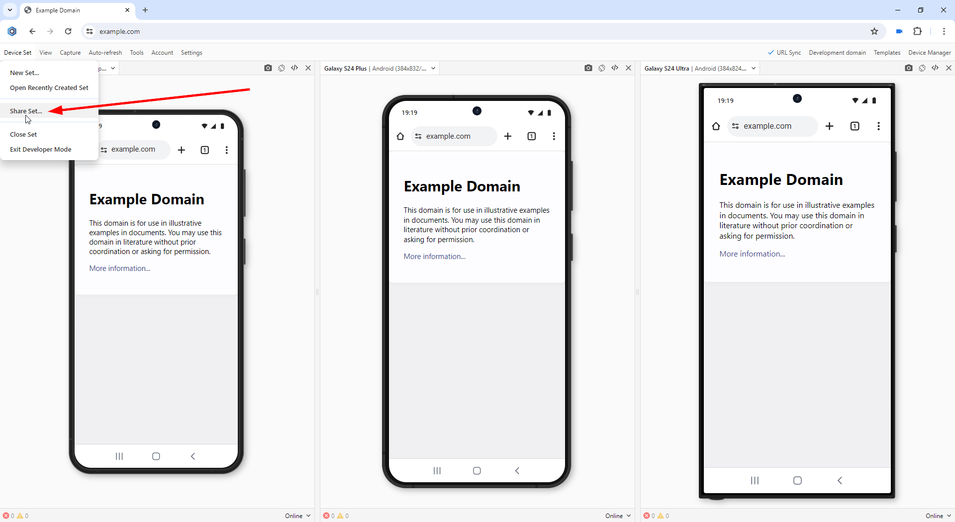
Test with your teammates on the iPhone 16 or Galaxy S23-S24 series
New Device Templates
Blisk has launched a new Templates manager. This manager provides the capability to use preconfigured device sets or to create custom personalized reusable device sets.
Device Templates streamline the process of setting up devices by removing the necessity to repeatedly create a device set from scratch. With this feature, users can effortlessly create a device template and then easily replicate it with just a few clicks.
The New Templates manager presents several key graphical user interface components. Firstly, there is the "My Templates" section, which displays a compilation of device templates that have been generated by the user. Secondly, users can access the "Default Templates," which includes a selection of device templates developed by the Blisk team. Additionally, there is a dedicated button that allows users to initiate the creation of a new Device Template.
New Image Editor
Blisk introduces new Image editor with this latest release, designed specifically for enhancing the annotation of your screenshots. This advanced tool provides users with greater flexibility and a variety of new functionalities for effectively marking up their screenshots. Among the newly introduced features are:
- Square cover tool.
- Ellipse cover tool.
- Callout tool.
- Freehand tool, and
- Highlight tool.
In addition to the core annotation tools, the new Image editor is equipped with an expanded array of features that enhance its usability:
- Users can now take advantage of a broader palette of colors, allowing for more personalized and visually appealing annotations.
- The inclusion of an opacity tool enables finer control over the visibility of annotations.
- New options for line style and arrow type provide additional customization.
- Users can select from various font styles and colors, ensuring that text annotations can be tailored to fit the overall aesthetic of the screenshot.
This comprehensive set of tools and features positions the new Image editor as a powerful asset for anyone looking to annotate screenshots with precision and creativity. By combining flexibility with a user-friendly interface, Blisk offers a better solution that caters to the diverse needs of our users, whether for professional presentations, educational materials, or personal projects.
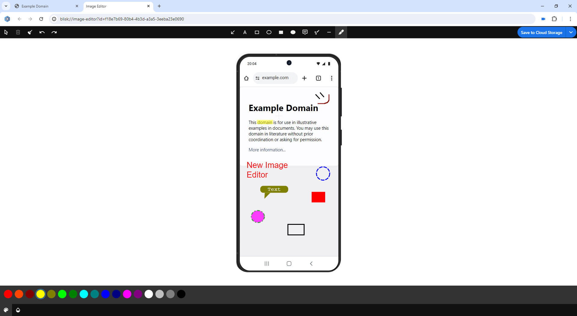
New Image Editor in Blisk v.24
Latest technologies support and security improvements
The current platform update includes new features, APIs, new CSS properties, and security improvements. Some of the most important features are described below:
CSS: font-palette property animation
The CSS font-palette property enables the selection of a particular palette for rendering a color font. With the recent enhancement that allows for the animation of this property, the transition between palettes is transformed from a distinct change into a fluid movement between two chosen palettes. This functionality is applicable across all CSS animations and transitions.
/* Using a font-defined palette */
font-palette: normal;

/* Using a user-defined palette */
font-palette: --one;

/* Creating a new palette by blending two others */
font-palette: palette-mix(in lch, --blue, --yellow);
CSS Scrollbars: scrollbar-color
The scrollbar-color property enables the customization of scrollbar colors, allowing them to align more closely with the overall design of a web page.
/* Keyword values */
scrollbar-color: auto;

/* <color> values */
scrollbar-color: rebeccapurple green; /* Two valid colors.
The first applies to the thumb of the scrollbar, the second to the track. */
CSS Scrollbars: scrollbar-width
The scrollbar-width property permits the implementation of slimmer scrollbars, which can be more appropriate for certain scenarios, or even the option to completely conceal the scrollbars while maintaining the ability to scroll.
/* Keyword values */
scrollbar-width: auto;
scrollbar-width: thin;
scrollbar-width: none;
CSS: align-content property for blocks
Web authors aiming to vertically center content often resort to unconventional methods or modify the display type to flex or grid. However, they can conveniently achieve vertical centering of block containers by utilizing the align-content property. The align-content CSS property is applicable to block containers and table cells, functioning specifically with flex and grid containers. It is compatible with various display types, including display: block, display: list-item, and display: table-cell, among others.
/* Keyword values */
scrollbar-width: auto;
scrollbar-width: thin;
scrollbar-width: none;
CSS: light-dark() Color Function
The light-dark() color function enables developers to specify distinct colors for both light and dark color schemes for individual elements. Depending on the color scheme applied to an element, system colors and user agent form controls are displayed in varying colors.
With the light-dark() function, developers can achieve similar functionality:
/* Keyword values */
#target {
  background-color: light-dark(lime, green);
}
In this example, the #target element will show up a green background when the element's color scheme is set to dark; conversely, it will display a lime background in a light color scheme.
CSS: field-sizing property
The field-sizing CSS property allows for the management of the sizing behavior of elements with a default preferred size, particularly form control elements. By utilizing this CSS property, you can modify the standard sizing behavior, enabling form controls to resize according to their content.
field-sizing CSS property is commonly applied to style text <input> and <textarea> elements, facilitating their ability to shrink to fit the content and expand as additional text is inputted into the form control.
/* Keyword values */
field-sizing: content;
field-sizing: fixed;
Feature: supports() condition for @import
CSS provides a supports() condition for the @import rule, enabling the conditional importation of stylesheets and layers based on feature support. When the specified conditions within supports() are not met, the corresponding stylesheet will not be retrieved, ensuring that only compatible styles are applied.
/* supports() condition for @import with fallback*/
@import url("fallback-layout.css") supports(not (display: flex));
@supports (display: flex) {
  ...
}
Feature: Storage Buckets API
Currently, websites lack control over the eviction of their stored data during browser storage pressure, particularly when users have limited disk space. The existing options are limited to either retaining or deleting all site data. The introduction of the Storage Buckets API will empower sites to categorize their data, manage storage quotas, and prioritize eviction, enabling them to determine which data bucket to clear first when storage is constrained.
The Storage Buckets feature allows websites to organize their on-device data into distinct "buckets," facilitating independent eviction of grouped data from other buckets. This capability enables sites to manage semantically related data more effectively. Each storage bucket can house data linked to established storage APIs, including IndexedDB and CacheStorage.
DevTools: New Autofill panel
This update introduces the Autofill panel in DevTools, enhancing Autofill's functionality for automatically populating web forms with stored addresses. The new panel allows users to examine the relationship between form fields, suggested autofill entries, and saved information.
To explore the panel, visit the demo page with sample data: https://goo.gl/B6Xs1E. First, in Profile Autofill, click any of the Fill form buttons, submit the form, and in the Save address dialog, select Save before returning to the form page. Next, access DevTools and initiate an autofill event by selecting a form field and choosing an address from the dropdown menu. The Autofill panel will then appear, displaying recognized form fields, inferred autofill options, and saved data.
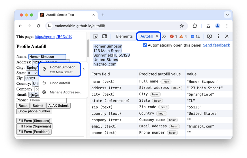
DevTools: New Autofill panel
DevTools Performance panel: hide functions
To eliminate unnecessary distractions from the flame chart located in Performance > Main, users now have the capability to conceal non-essential functions along with their associated child functions. Within the flame chart, simply right-click on a specific function and select an appropriate option from the context menu that appears.
Functions that contain hidden children feature a drop-down button, represented by an arrow pointing downwards, located on the right side. By hovering over this button, users can view the count of hidden children, and clicking on it will reveal them once more. To revert the flame chart to its original state, simply right-click on the desired function and choose the option to reset the trace.
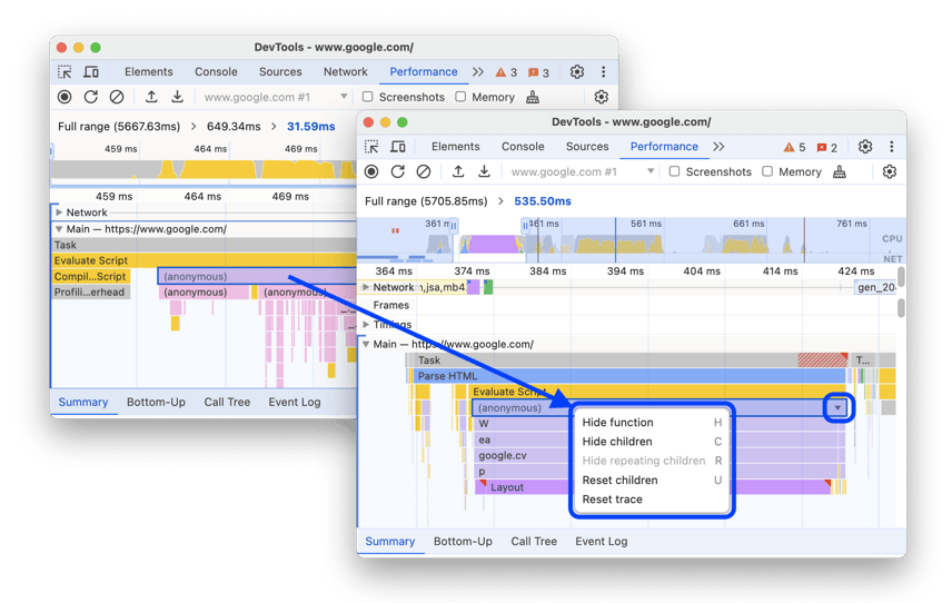
DevTools: Hide functions and their children in the flame chart
DevTools Application panel updates
Bytes used for shared storage
The Shared Storage section within the Application > Storage menu now displays the total number of bytes utilized by a specific origin.
DevTools: Hide functions and their children in the flame chart
Web SQL is fully deprecated
Blisk has officially deprecated Web SQL in version 23, eliminating the deprecation trial token associated with it, which means that Web SQL is no longer available for use. In alignment with this change, DevTools has also removed the Web SQL section from the Application panel, ensuring that users no longer have access to this feature.
DevTools: Color Picker, Angle Clock, and Easing Editor in var() fallbacks
The Elements > Styles tab has been enhanced to facilitate easier CSS editing by incorporating tools such as the Color Picker, Angle Clock, and Easing Editor, which can now be utilized within var() fallbacks. This improvement aims to streamline the design process, allowing developers to make more intuitive adjustments to their styles directly within the interface.
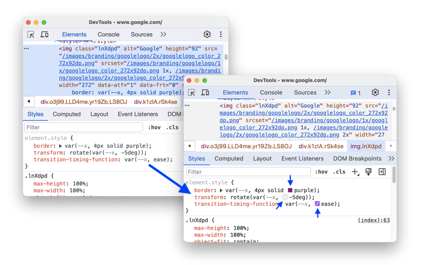
DevTools: Improvements in var() fallbacks
DevTools Sources: Enable and disable all breakpoints
The Sources > Breakpoints section has reenabled the options to enable and disable all breakpoints within its drop-down menu. These functionalities were omitted during the recent redesign of the breakpoints feature.
To toggle all breakpoints on or off, simply right-click on any breakpoint within the Sources > Breakpoints area and choose the appropriate option from the menu.
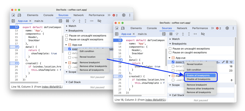
DevTools: Enable and disable all breakpoints
DevTools: @font-palette-values support
The Elements panel has been updated to support the @font-palette-values CSS at-rule, allowing for customization of the default values associated with the font-palette property.
To modify these values, navigate to the Styles section, click on the font-palette property value, and DevTools will direct you to the specific @font-palette-values section for editing your custom settings.
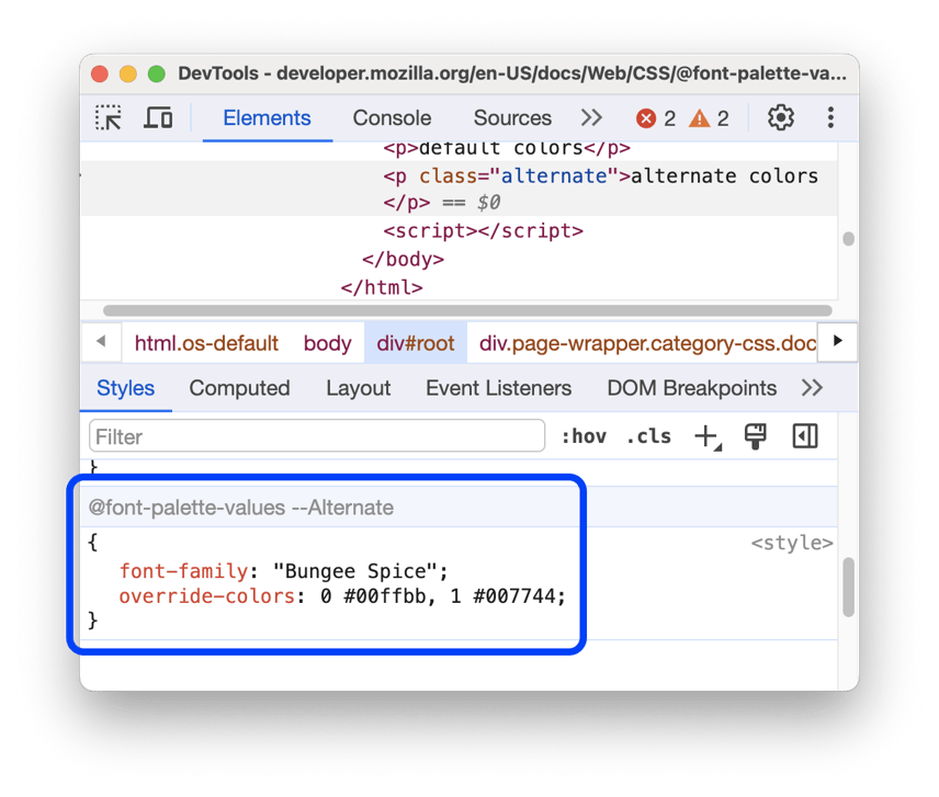
DevTools: @font-palette-values
DevTools: Improved Copy submenu
The organization of the Copy submenu within a request has been significantly improved for enhanced usability. The Copy as cURL feature has been updated to ensure that the correct command is copied correctly to the clipboard on Windows systems.
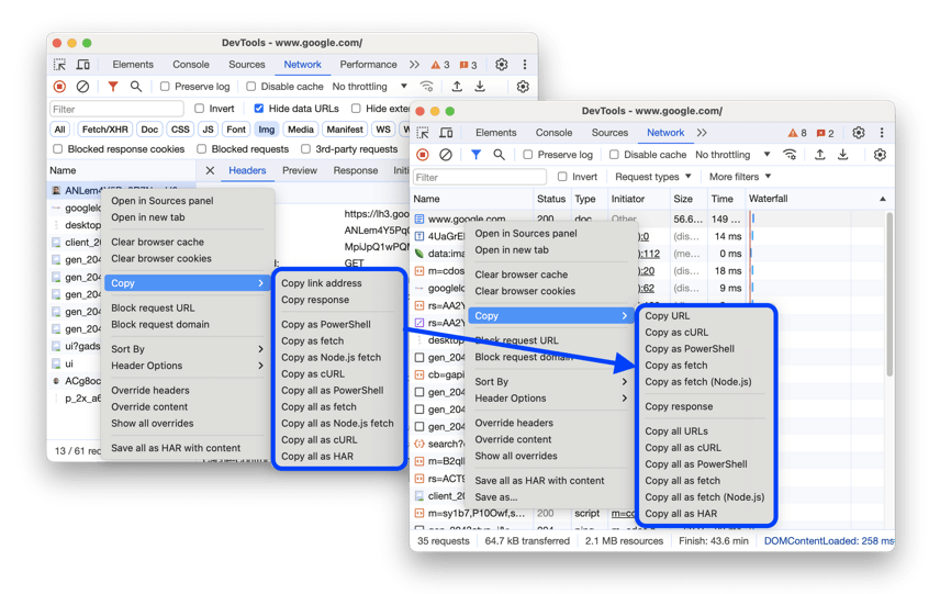
DevTools: Improved Copy submenu
DevTools: Event initiators in the Main track
The Performance > Main track now features arrows by default that illustrate the connections between initiators and the subsequent events they triggered. To view these arrows, simply locate an event within the trace and click on it. This functionality was previously in the experimental phase.
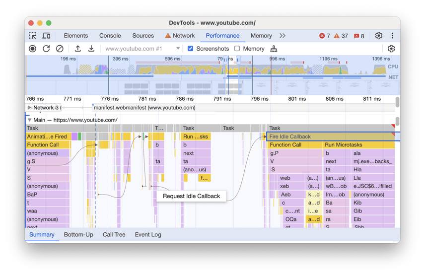
DevTools: Event initiators
DevTools: Custom property as a fallback of another custom property
A recent enhancement in DevTools has been introduced, specifically within the Elements > Styles section. This update allows for the resolution of a custom property that serves as a fallback for another custom property, thereby improving the functionality and usability of the styling tools available to developers.
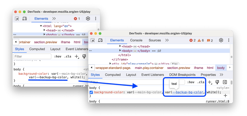
DevTools: Custom property as a fallback
DevTools: Enhanced Interactions track
A new addition to DevTools has been introduced: the Enhanced Interactions track. Within the Performance > Interactions track, users will now notice whiskers that visually represent input and presentation delays occurring at the boundaries of processing times. This enhancement aims to provide developers with clearer insights into performance metrics, allowing for more effective debugging and optimization of web applications. Hovering over an interaction will reveal a useful tooltip that provides detailed timing information, enhancing the overall user experience and facilitating better performance analysis.
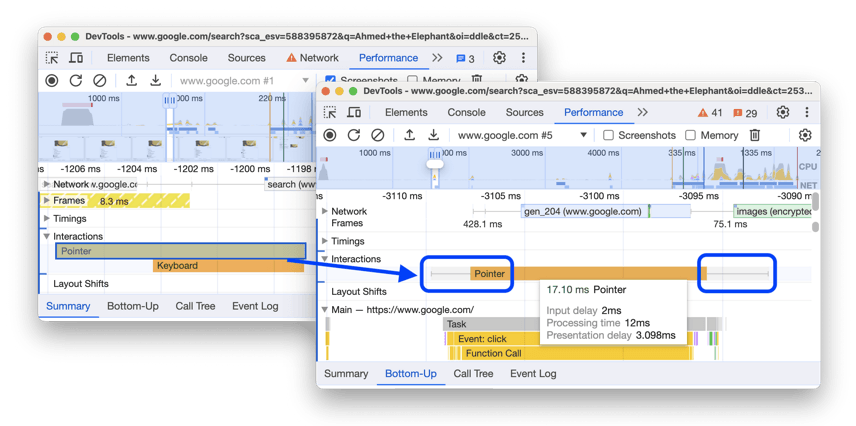
Enhanced Interactions track
DevTools: Advanced filtering in Bottom-Up, Call Tree, and Event Log tabs
A new enhancement has been introduced in DevTools, specifically within the Performance panel, which includes filtering in the Bottom-Up, Call Tree, and Event Log tabs. These tabs now feature three additional buttons designed for advanced filtering capabilities:
- Case sensitivity.
- Regular expressions.
- Matching whole words.
This improvement allows for a more precise filtering experience. To enhance user experience and maintain context, the filtering in the Bottom-Up tab has been refined so that only top-level items will be affected by the filter, as opposed to the previous functionality where every node was included in the match.
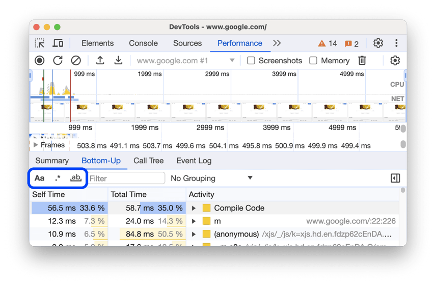
Advanced filtering in Bottom-Up, Call Tree, and Event Log tabs
DevTools: Indentation markers in the Sources panel
The Editor in Sources panel has been updated to enhance the user experience by incorporating vertical lines that delineate indented code blocks, providing a clearer visual reference for developers.
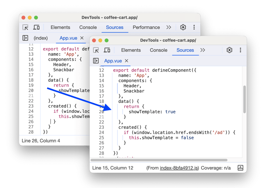
Indentation markers in the Sources panel
Learn the basics of using Blisk:
Learn more about Developer Mode, Development Domain, and Device Manager on Blisk Documentation.
Article tags:
BliskbrowserreleaseiPhone 16iPhone 16 PlusiPhone 16 ProiPhone 16 ProtemplatesImage editor