Published on Tuesday, Apr 23, 2024 Author: Blisk team
Blisk release 23.0.185.91
Mobile test on Google Pixel 7, Pixel 7 Pro, Pixel 7A, Pixel 8, and Pixel 8 Pro with the latest technologies support. End of support for macOS 10.13 and 10.14
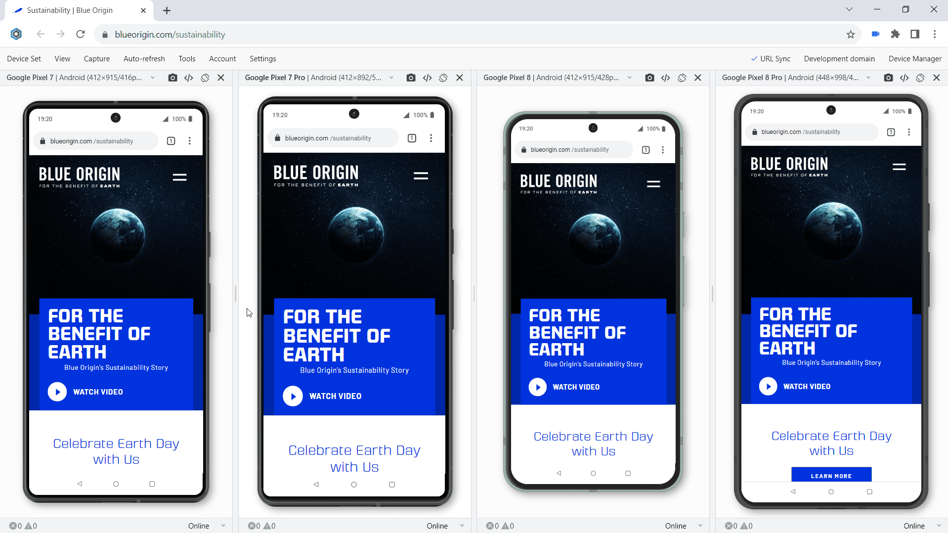
We are excited to release the new features: Mobile test on Google Pixel 7, Pixel 7 Pro, Pixel 7A, Pixel 8, and Pixel 8 Pro.
Notice: The previous release (v.22) was the last to support macOS High Sierra and Mojave. With the current release, Blisk ends support of macOS 10.13 and 10.14. The users on macOS High Sierra and Mojave will no longer receive updates from Blisk. Update your macOS to a newer version (10.15 or more) to continue receiving updates. Learn more...
Google Pixel 7, Pixel 7 Pro, Pixel 7A, Pixel 8, and Pixel 8 Pro are ready to use in the Blisk app, where you can run a mobile test, responsive test, or cross-device test. These devices are preinstalled in the Blisk app, so you don't need to download or install anything other than the Blisk app. The latest Androids run directly on your PC, Mac, or Linux, and the code runs locally, avoiding potential data loss or security issues.
Requirements: this feature is available in Blisk v.23.0.185.91 and later. You may need to update the Blisk application to use this feature. How to update Blisk...
Starting with v.23.0.185.91, Blisk opens new possibilities for running different kinds of mobile tests on Google Pixel 7, Pixel 7 Pro, Pixel 7A, Pixel 8, and Pixel 8 Pro: responsive test, multi-device test, touch events test, performance test, landscape orientation test, dark mode test, test for page errors, slow Internet connection test, etc.
Google Pixel 7
Google Pixel 7 has a 6.3-inch screen with 1080px × 2400px resolution, 412px × 915px viewport, and CSS Pixel Ratio 2.625.
Google Pixel 7 Pro
Google Pixel 7 Pro has a 6.7-inch screen with 1440px × 3120px resolution, 412px × 892px viewport, and CSS Pixel Ratio 3.5.
Google Pixel 7A
Google Pixel 7A has a 6.1-inch screen with 1080px × 2400px resolution, 412px × 915px viewport, and CSS Pixel Ratio 2.625.
Google Pixel 8
Google Pixel 8 has a 6.0-inch screen with 1080px × 2400px resolution, 412px × 915px viewport, and CSS Pixel Ratio 2.625.
Google Pixel 8 Pro
Google Pixel 8 Pro has a 6.7-inch screen with 1344px × 2992px resolution, 448px × 998px viewport, and CSS Pixel Ratio 3.0.
The specifications, viewport size, screen size, pixels per inch (PPI), and CSS Pixel Ratio for new devices are available on the Device portal, where you can find the device metrics for all devices including the latest Google Pixels 7-8 series:
Test whether your website supports responsive design and looks great on the latest Apple mobile devices. Such a mobile test will locate issues with the responsive layout and user experience issues on mobile devices. So now you can test responsive design on Google Pixel 7, Pixel 7 Pro, Pixel 7A, Pixel 8, and Pixel 8 Pro and compare the layout with laptops, desktops, and iPads.
Responsive test on Google Pixel 8 and Chrome-like desktop
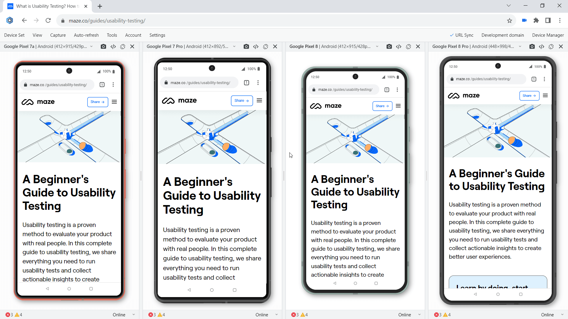
Test on Google Pixel 7-8 or use it with other devices such as other Android or iOS mobile phones, iPadOS tablets, Windows and macOS laptops, and desktops. When you use mobile and desktop at the same time, you are running mobile and desktop tests simultaneously. It becomes much easier to compare devices side-by-side. Starting with version 19.1, you can test on Google Pixel 7, Pixel 7 Pro, Pixel 7A, Pixel 8, and Pixel 8 Pro simultaneously with other devices.
Check if your website supports touch events and gestures on the Google Pixels 7-8 series. Touch is a key element in any mobile test because all interactions on mobile are done using touch. Blisk offers built-in compatibility with touch events and gestures support on Google Pixel 7, Pixel 7 Pro, Pixel 7A, Pixel 8, and Pixel 8 Pro, enabling convenient testing and eliminating the need for an actual mobile device. In addition, you can use Developer Tools on each device separately to track touchstart, touchend, touchcancel, or touchmove.
Test how your website behaves in landscape mode on the latest Androids. Landscape orientation helps to find issues with layout and user experience. Google Pixel 7, Pixel 7 Pro, Pixel 7A, Pixel 8, and Pixel 8 Pro in Blisk have an option to change the orientation with just one click providing the users with a clear vision of what happens on the mobile phones of the end users. Although portrait and landscape orientations differ only in that the viewport is rotated 90 degrees, their differences in size are significant. Usually, this difference is overlooked but causes issues for your users on mobile.
Landscape orientation test on Google Pixels 7-8 series
Utilize Developer Tools to test and troubleshoot your website across various devices. Blisk allows you to access Developer Tools on a per-device level with simultaneous usage of DevTools on multiple Google Pixel devices such as Pixel 7, Pixel 7 Pro, Pixel 7A, Pixel 8, and Pixel 8 Pro. These tools enable you to inspect webpage elements, identify errors, monitor network requests, and resolve other development-related problems.
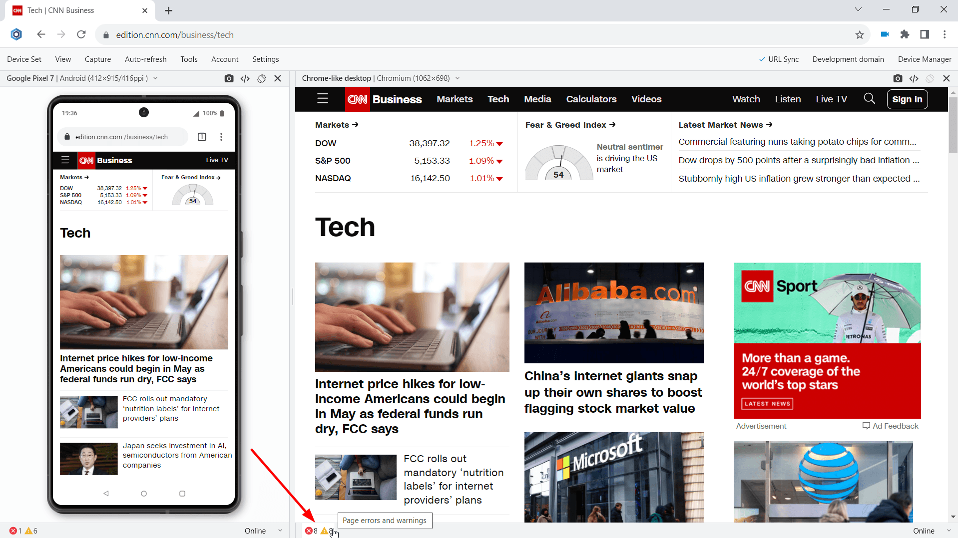
Monitor for webpage errors that appear on the latest Androids and fix the issues before they become critical. The errors on mobile devices may be different from errors on desktops. Starting with version 19.1, you can track in real-time JavaScript page errors and resources that failed to load on Google Pixel 7, Pixel 7 Pro, Pixel 7A, Pixel 8, and Pixel 8 Pro.
Test for webpage errors on Google Pixels 7-8 series
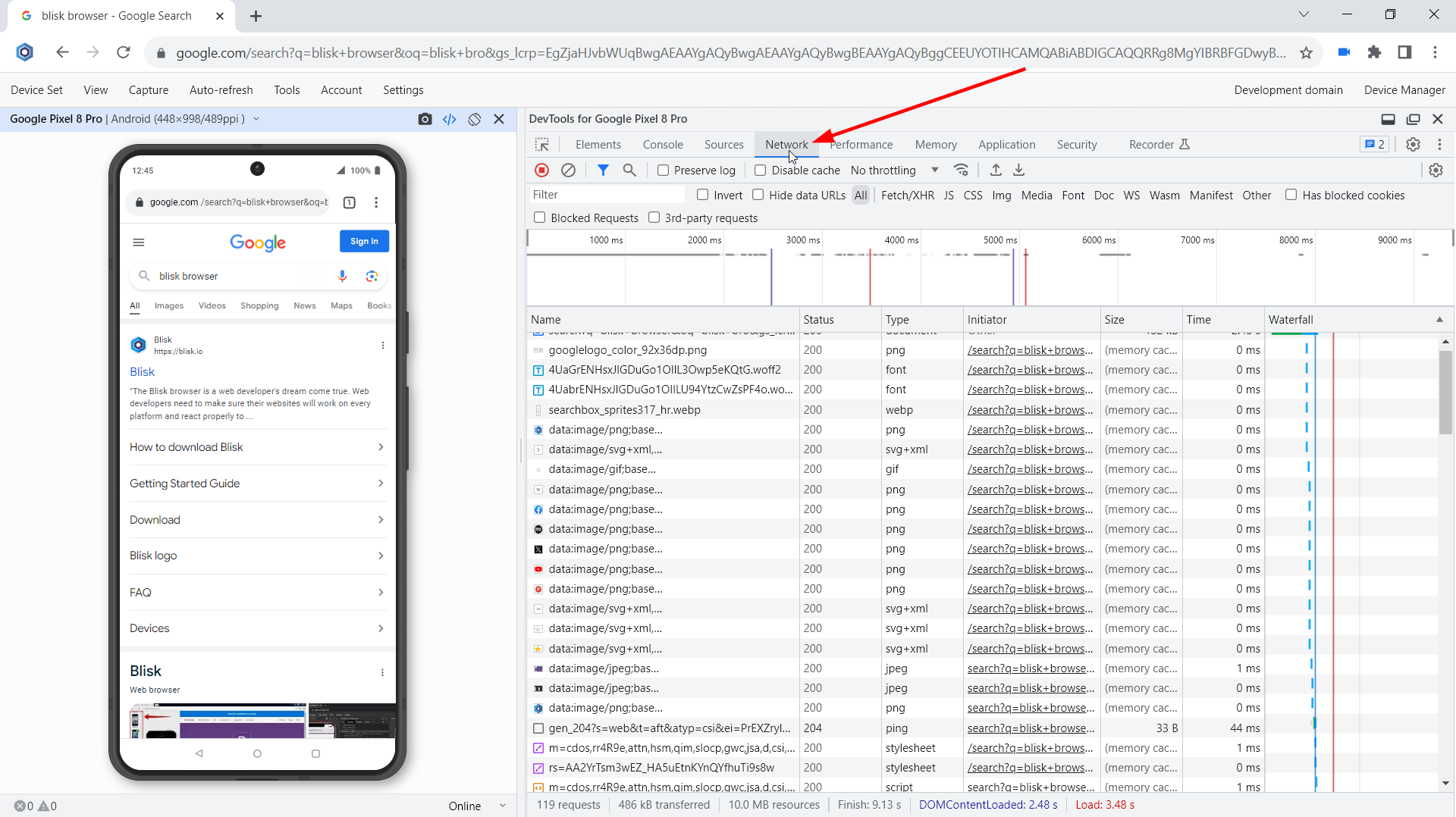
Run mobile tests in terms of webpage speed and performance. Webpage speed is critical on mobile, low speed leads to loss of users. Use the Network tab in the Developer Tools to conduct this important mobile test. This test is now available for the latest Google Pixels 7-8 series.
Check whether your website supports the dark mode on brand-new Androids by running Blisk in dark mode. A lot of mobile users prefer using dark mode at nighttime. That is why the support for dark mode has become a must-have for modern applications. By enabling dark mode in Blisk, you can simulate dark mode on the latest flagships from Google, check if the UI works well under night lighting, and check the contrast.
Simulate various real-life scenarios on modern Android devices, like a sluggish internet connection. Blisk allows for the simulation of 2G, 3G, and 4G mobile networks with varying Internet speeds. The Slow 3G setting will help you run a custom mobile test and find the resources consuming all the bandwidth on the Google Pixels 7-8 series. In addition, you can adjust the network speed on each latest Google Pixel differently and compare the results across a set of devices.
Test the user experience on mobile devices, uncover problems in the design, discover opportunities to improve the design, and learn about users' behavior and preferences.
Starting with version 19.1, you can share device sets with the latest Google Pixels 7-8 series via the Blisk link (use Menu ➜ Device Set ➜ Share Device Set). Your teammate can launch the same device set and run the mobile test on the same URL and settings.
Test with your teammates on the Google Pixels 7-8 series
The previous release (v.22) was the last to support macOS High Sierra and Mojave. Blisk ends support of macOS High Sierra and Mojave. Blisk has made every effort to maintain support for older versions of macOS for as long as possible but is no longer able to support them due to the outdated technologies they use. The other popular browsers such as Chrome, Firefox, Edge, Brave, etc. have already ended their support for macOS High Sierra and Mojave in 2023.
Notice: Update your macOS to version 10.15 or more to continue receiving updates from Blisk. After updating macOS, you will continue receiving updates and benefit from the latest features and improvements from Blisk.
It is important to stay up-to-date with your operating system to maintain compatibility with the latest software updates, security improvements, and to support the latest technologies.
The current platform update includes new features, APIs, new CSS properties, and security improvements. Some of the most important features are described below:
The new CSS Overlay property allows authors to keep elements in the top layer for an exit transition. The overlay property is added to indicate whether the element is in the top layer, or not. It can take two values: none or auto. User Agent stylesheets add !important rules to control whether elements are rendered in the top layer, and do not let the author perform styles override. However, authors can add overlay to the list of transition properties for an element to defer the removal from the top layer for the duration of the transition. That way the author can do exit transitions for elements like dialog:
Array grouping is a common operation in programming, often utilized with SQL's GROUP BY clause and MapReduce programming to compute higher-order datasets like the average age of a cohort or daily LCP values for a webpage.
The Object.groupBy and Map.groupBy static methods facilitate array grouping by calling a callback function for each element in an iterable, returning a string or symbol to indicate the group of the elements.
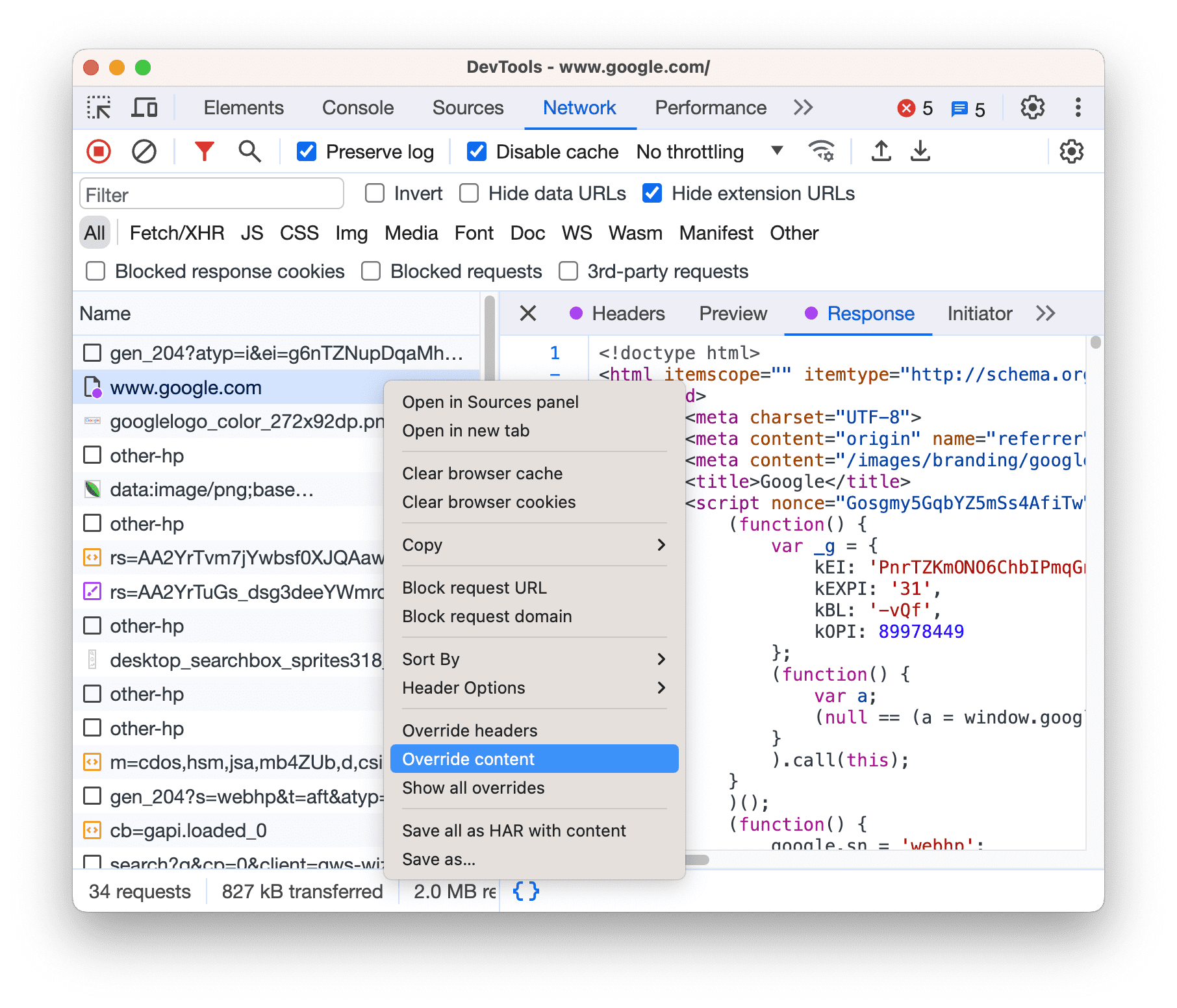
Utilize the Local Overrides feature to conveniently manipulate response headers and remote resources web contents through the Network panel without direct access.
To modify web content: access the Network panel, right-click on a specific request, and choose the Override content option.
Override content feature
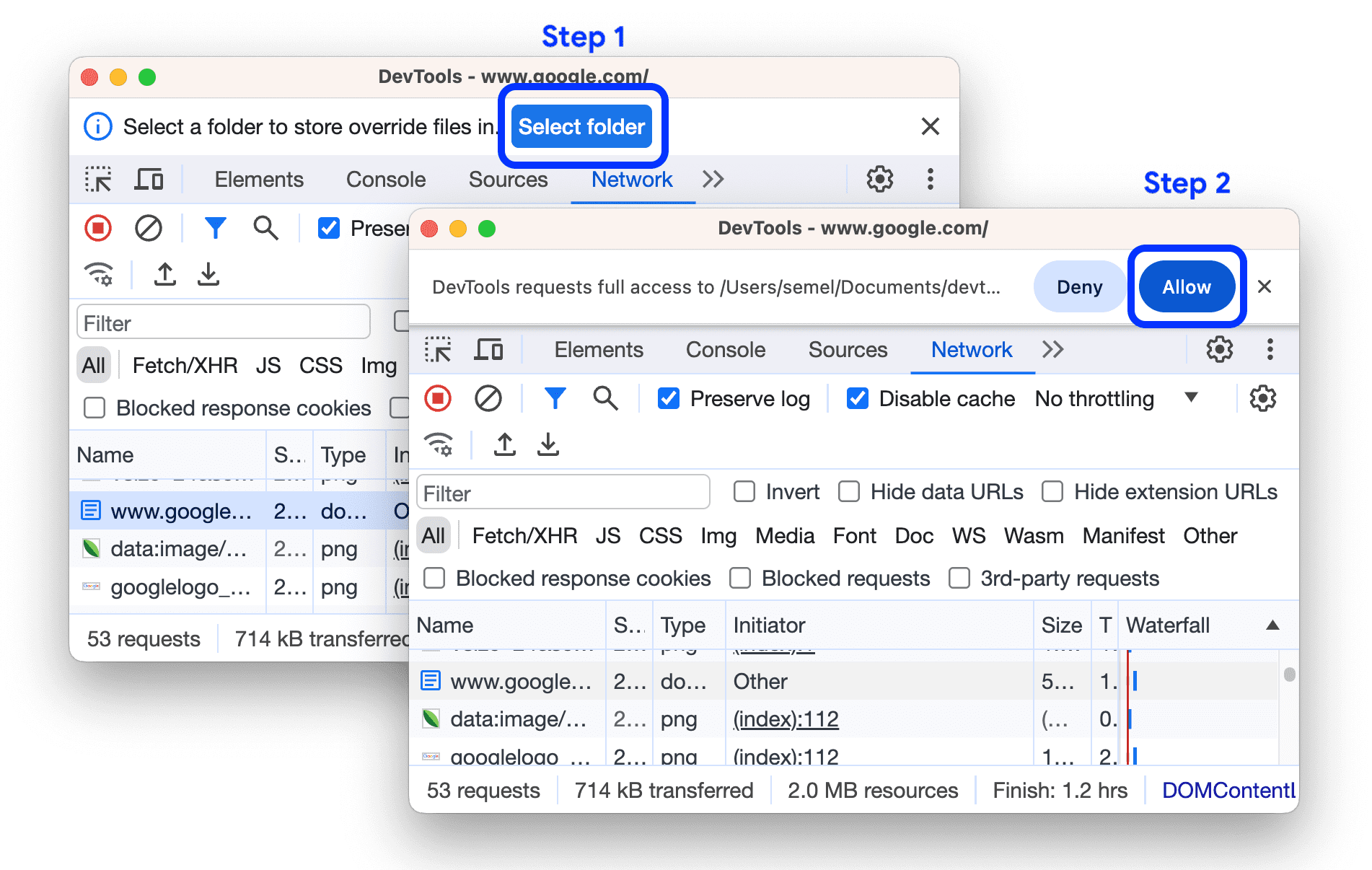
When Local overrides are configured but turned off, DevTools will activate them. If you have not configured them yet, DevTools will request you to do so through the action bar at the top. Choose a directory to save the overrides and permit DevTools to access it.
Select a folder for Local overrides
After configuring the overrides, DevTools will guide you to Sources > Overrides > Editor with an option to override web content.
Authors can now initiate CSS transitions on the first style update by utilizing @starting-style rules, allowing for transitions from initial styles even when the display type changes from none to another type.
By applying styles within a @starting-style rule, authors can ensure that transitions are triggered from the first style update, providing more control over the transition process.
When there are selectors inside @starting-style rules that match an element without pre-existing styles, the computed style will first consider rules within @starting-style before transitioning to the final style without @starting-style rules.
div {
  transition: background-color 0.5s;
  background-color: lime;
}

@starting-style {
  div {
    background-color: green;
  }
}
Typographic widows and orphans refer to single words at the end of a paragraph or text block, with widows at the top and orphans at the bottom. They can disrupt reading flow and some designers take great measures to avoid them.
With Blisk 23, orphans can be prevented using a simple line of CSS: text-wrap: pretty.
CSS text-wrap: pretty
This feature not only prevents single-word endings but also adjusts hyphenation and text justification for better readability. text-wrap: pretty focuses on improving line wrapping and text breaking, particularly targeting orphans, with potential for further enhancements in the future.
The transition-behavior CSS property is an extended version of the transition property that enables the use of discrete properties (e.g. visibility and display) in transitions. When the allow-discrete value is set for transition-behavior, discrete properties will initiate animations and transition from their initial value to their final value at 50%, except when display: none and content-visibility: hidden are used as initial or final values. In such cases, the visible value will be maintained throughout the transition duration.
.card {
  transition: opacity 0.25s, display 0.25s;
  transition-behavior: allow-discrete; /* Note: be sure to write this after the shorthand */
}

.card.fade-out {
  opacity: 0;
  display: none;
}
By using the allow-discrete keyword at the end of the transition shorthand for each transition, you can set the value without explicitly mentioning the transition-behavior property.
Example 1:
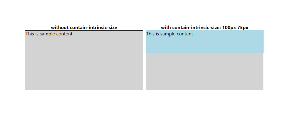
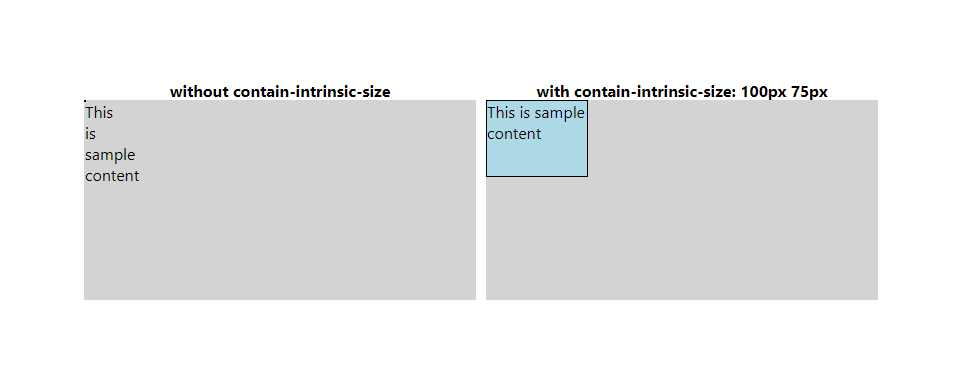
Adding the contain: size property to the left-hand-side div prevents its children from affecting its size. As a result, the div retains its full width but has a height of 0. On the other hand, the right-hand-side element uses the contain-intrinsic-size property to determine its size, maintaining the full width but adjusting the height to match its contain-intrinsic-size height.
Example 1 for contain-intrinsic-size
Example 2:
The width of the elements in this example is determined by the max-content size, which uses intrinsic size information. However, when size containment is applied, information for the child cannot be utilized. When size containment is enabled, the left-hand side element has a width and height of 0, and its content displays with overflow. On the other hand, the right-hand side element uses the contain-intrinsic-size property to size both the width and height according to the specified size.
The view-timeline shorthand is now shorthand for view-timeline-name, view-timeline-axis, and view-timeline-inset. Previously, view-timeline-inset was not part of the shorthand.
The @scope CSS at-rule allows selecting elements within specific DOM subtrees, offering precise targeting without the need for overly specific selectors that are difficult to override or tightly coupled to the DOM structure.
Within JavaScript, @scope can be accessed through the CSS object model interface CSSScopeRule, providing a way to define scoped style rules and apply them to selected elements within a defined scope.
There are two ways to use @scope:
As a standalone block in CSS with a prelude section defining the scope bounds
@scope (scope root) to (scope limit) {
  rulesets
}
As inline styles within a <style> element in HTML automatically scoped to the parent element of the <style> element
The <search> element denotes a section of a document or software that encompasses a collection of form controls or other information about conducting a search or filtering task. This may involve searching the website or application, filtering search results on the current page, or performing a global or Internet-wide search function.
The <search> element applies a "search" role for accessibility.
The <search> element should not display search results; instead, search or filtered results should be integrated into the main content of the webpage. However, suggestions and links related to the "quick search" functionality can be nested within the <search> element as search features.
The CSS media feature known as prefers-reduced-transparency is utilized to determine whether a user has activated a feature on their device that reduces the transparency effects. Enabling this setting can enhance contrast and readability for certain users.
Different operating systems offer options to decrease transparency, which user agents tend to depend on. In cases where a particular setting is unavailable, user agents may also rely on more subtle cues from the platform.
In Windows 10/11: Settings > Personalization > Colors > Transparency effects.
In macOS: System Preferences > Accessibility > Display > Reduce transparency.
In iOS: Settings > Accessibility > Display & Text Size > Reduce Transparency.
To adhere to the requirement of supporting only standard appearance keywords, Blisk eliminates the usage of non-standard appearance keywords. This entails removing the appearance and -webkit-appearance keywords that are no longer deemed necessary to be supported. The following non-standard appearance keywords will be removed:
inner-spin-button: This keyword refers to the appearance of a spin button that is typically found within an input field.
media-slider: This keyword pertains to the appearance of a slider control used for media playback.
media-sliderthumb: This keyword is associated with the appearance of the thumb or handle of a media slider.
media-volume-slider: This keyword relates to the appearance of a slider control specifically designed for adjusting media volume.
media-volume-sliderthumb: This keyword refers to the appearance of the thumb or handle of a media volume slider.
push-button: This keyword pertains to the appearance of a button that triggers an action when pressed.
searchfield-cancel-button: This keyword is associated with the appearance of a cancel button within a search field.
slider-horizontal: This keyword refers to the appearance of a horizontal slider control.
sliderthumb-horizontal: This keyword is associated with the appearance of the thumb or handle of a horizontal slider.
sliderthumb-vertical: This keyword pertains to the appearance of the thumb or handle of a vertical slider.
square-button: This keyword refers to the appearance of a button with a square shape.
By removing these non-standard appearance keywords, we ensure that Blisk only supports standard appearance keywords.
SVGImageElement.crossOrigin is responsible for implementing the crossOrigin attribute specifically for SVG images. This attribute is applicable to the <image> and <feImage> elements and serves the purpose of enabling the configuration of Cross-Origin Resource Sharing (CORS) requests for the data fetched by these elements.
By utilizing the crossOrigin attribute, developers can control how the browser handles CORS requests for SVG images. The attribute supports three possible values:
anonymous;
use-credentials;
"" (which represents anonymous).
These values align with the options available for crossOrigin attributes in other contexts. The anonymous value indicates that the request should be made without including any credentials, while use-credentials signifies that the request should include the appropriate credentials. Lastly, an empty value denotes that the request should be treated as anonymous.
The feature enables the modification of the reference box calculation for the transform property. This enhancement provides more flexibility in creating various transforms and graphical effects. For instance, it allows for scenarios where the width of an element's border does not impact the outcome, such as rotating around a specific point within the content box. Additionally, it enables adjustments where the stroke of an (SVG) element should affect the result, like rotating a shape with a stroke around its center, including the stroke itself.
By allowing changes in how the reference box is computed for the transform property, users can achieve more precise and customized transformations in their designs. This capability opens up new possibilities for creating visually appealing effects without being constrained by the default settings. Whether it involves isolating certain elements from influencing the transformation or incorporating specific attributes like strokes into the calculations, this feature empowers designers to fine-tune their graphical elements with greater control and creativity.
The @property CSS at-rule is now supported in the Elements panel. This feature allows you to define CSS custom properties explicitly and register them in a stylesheet eliminating the need for any JavaScript code.
To examine the custom properties that you have registered, you can navigate to the Elements > Styles section. Once there, hover over the name of the property and a tooltip will appear, displaying its descriptors. Within the tooltip, you can click the link to view the registered property in the collapsible @property section. This provides a convenient way to inspect and manage your custom properties directly within the Elements panel.
The Sources panel now offers a more efficient workspace experience. One of the key improvements is the consistent naming of the different panes within the panel. For example, the pane previously known as Sources > Filesystem has been renamed to Workspace. This change helps to eliminate any confusion and ensures that the user interface texts in this pane are now clearer and more concise.
In addition to the naming consistency, the setup process for the Workspace feature has also been enhanced. Users will now find better cues when it comes to dragging and dropping folders or selecting a folder by clicking on a link. These cues make it easier for users to navigate and set up their Workspace, improving their workflow within the Sources panel.
One of the standout features of the Sources > Workspace is the ability to sync any changes made in DevTools directly to the source files. As a result, any modifications or updates made within the development tools will automatically be reflected in the corresponding source files. This seamless synchronization ensures that developers can work efficiently and eliminates the need for manual file updates.
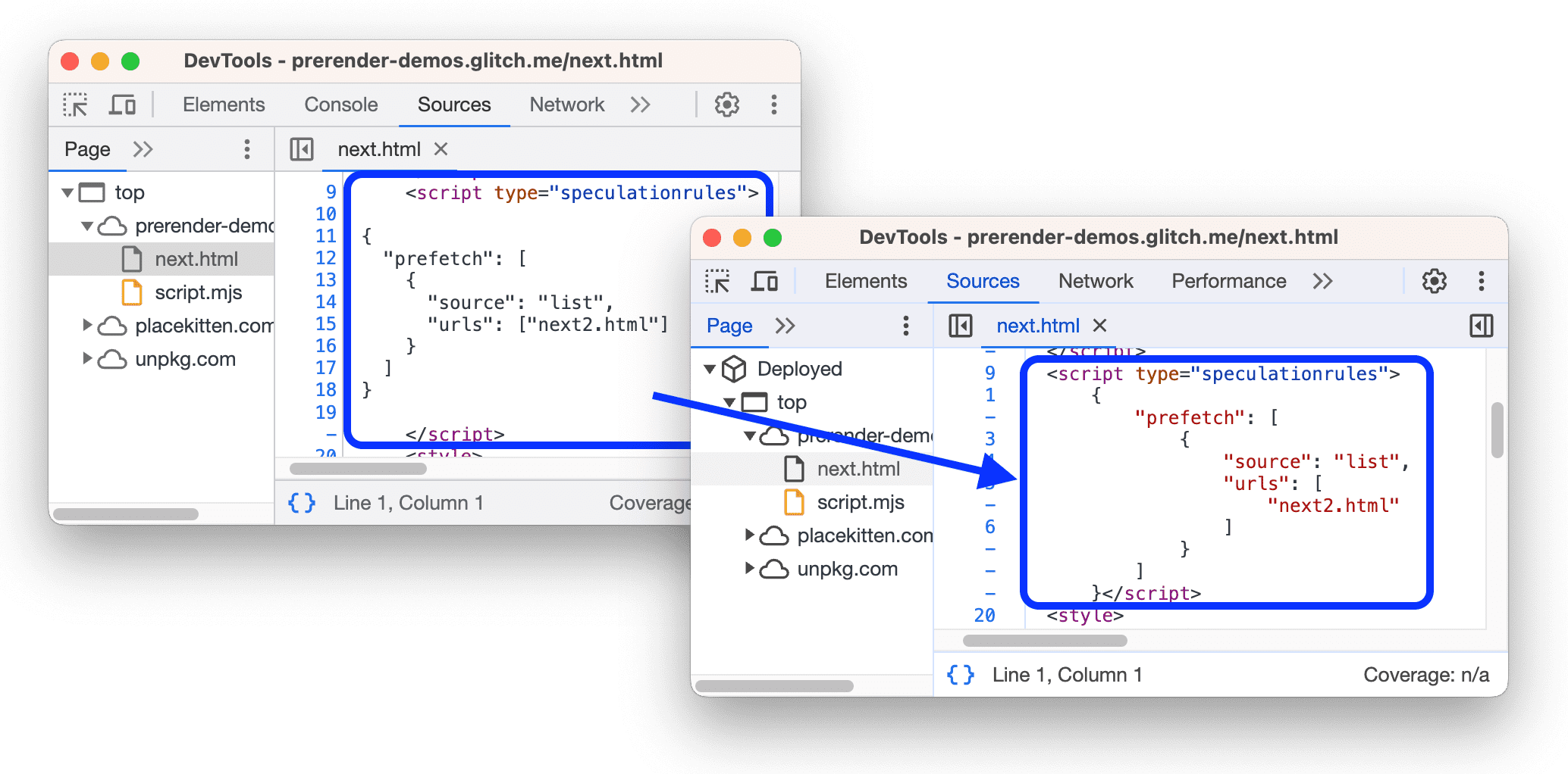
The Sources panel has been enhanced to provide syntax highlighting and pretty-printing for a wider range of script types. Specifically, it now supports the ability to pretty-print inline JavaScript within script types such as module, importmap, and speculationrules. This feature allows developers to easily read and understand the code within these script types, making debugging and troubleshooting more efficient.
In addition to pretty-printing inline JavaScript, the Sources panel also offers syntax highlighting for the importmap and speculationrules script types. Both script types contain JSON, and by highlighting the syntax within these scripts, developers can quickly identify any errors or inconsistencies in the code. This helps improve overall code quality and ensures that scripts function as intended.
DevTools: pretty printing for more script types
By incorporating syntax highlighting and pretty-printing for script types, the Sources panel provides developers with a more comprehensive toolset to work with different types of scripts. These features not only enhance the readability of the code but also make it easier to spot and fix any issues that may arise during development. Overall, these improvements contribute to a more streamlined and efficient coding experience for developers using the Sources panel.
The CSS pseudo-class :user-valid is used to target form elements that have been validated successfully according to their validation rules. This pseudo-class differs from :valid in that it only applies once the user has interacted with the form element.
When a user fills out a form field and the input meets the specified validation criteria, the :user-valid pseudo-class can be applied to style the element accordingly. This can be useful for providing visual feedback to users about the validity of their input.
:user-valid {
  /* ... */
}
When the user tries to submit a form, the :user-invalid pseudo-class is applied to elements that are either :invalid, :out-of-range, or blank-but :required. This pseudo-class remains active until the user interacts with the form element again.
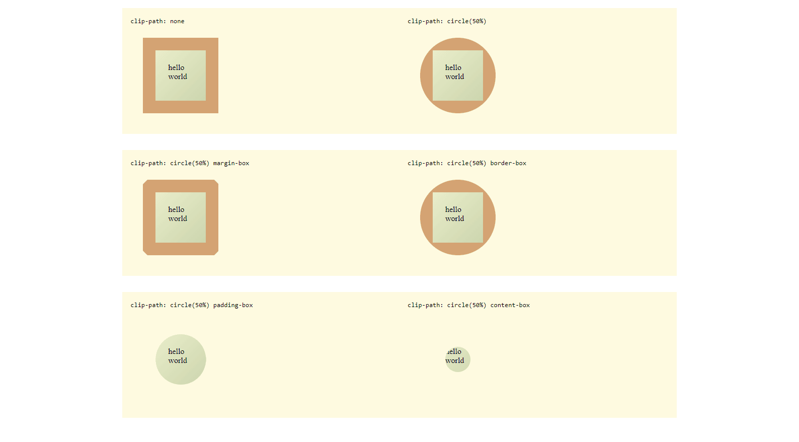
Clip-path offers support for <geometry-box> values, which allow for the manipulation of the clip's reference box, ultimately simplifying the usage of clip-path. These box values can either be combined with basic shapes, such as in the case of clip-path: circle(50%) margin-box, or they can be utilized independently to clip to the designated box, as seen in clip-path: content-box.
By incorporating <geometry-box> values into clip-path, users have greater flexibility and control over how the clipping is applied. This feature enables more precise and customized clipping options, whether it involves using basic shapes in conjunction with box values or solely focusing on clipping to a specific box. Overall, the inclusion of <geometry-box> values enhances the functionality and usability of clip-path, making it a more versatile tool for web developers and designers.
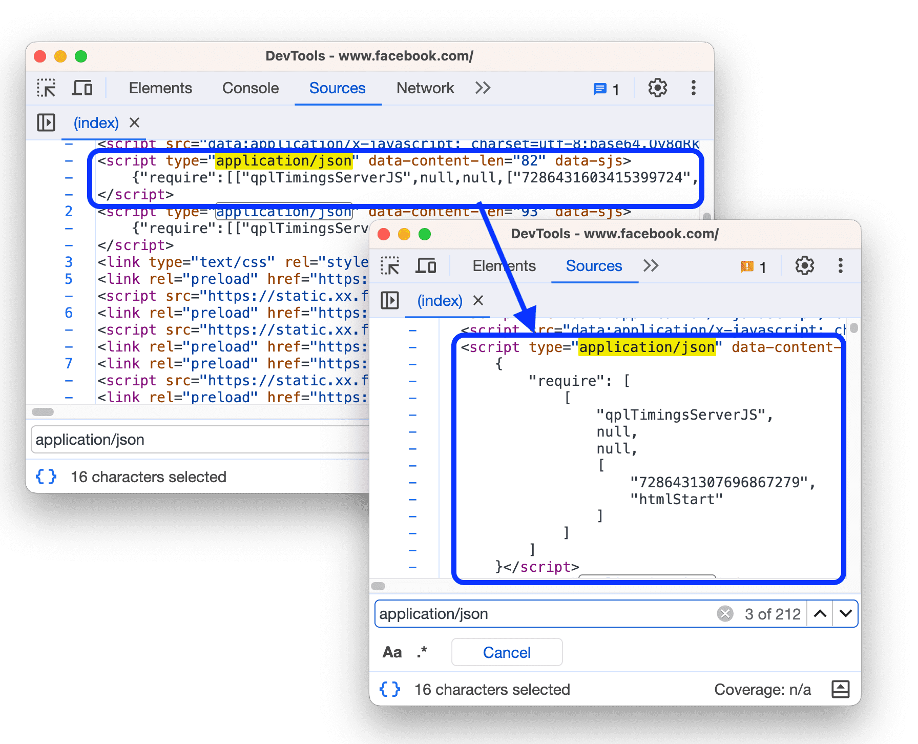
With the latest update, developers can now effortlessly format inline JSON within <script> HTML tags in the Sources panel. This means that JSON data embedded within script tags will be displayed in a visually appealing and well-structured manner, making it easier to analyze and debug. This feature greatly enhances the debugging experience by providing a clear and concise representation of the JSON data, allowing developers to quickly identify and resolve any issues.
The CSS pseudo-class selector :dir() is used to target elements based on their directionality, which is determined by the HTML dir attribute. :dir(ltr) - selects elements with left-to-right text directionality, while :dir(rtl) targets elements with right-to-left text directionality. It is important to note that :dir() is not the same as [dir] attribute selectors because it specifically targets directionality inherited from a parent element with the dir attribute. Additionally, it also considers the directionality computed from the use of dir=auto, which determines the text direction based on the first character with strong directionality in the text.
The :dir() CSS pseudo-class selector provides a more nuanced way to style elements based on their text directionality, allowing for more precise control over the appearance of a webpage. This selector is useful when dealing with multilingual websites or texts that vary in direction within the same document. By understanding how the :dir() pseudo-class selector works and its differences from attribute selectors, developers can create more robust and adaptable stylesheets for their web projects.
With release 23, Blisk starts supporting CSS exponential functions such as pow(), sqrt(), hypot(), log(), and exp() into CSS math expressions to enhance the capabilities of styling. These functions allow more complex mathematical calculations to be performed directly within the CSS code, providing greater flexibility and creativity in designing layouts and visual elements on a webpage. By leveraging these functions, developers can achieve more dynamic and interactive designs not limited by traditional CSS properties and values.
pow(): The CSS function pow() calculates the value of a number raised to a specified power.
sqrt(): The sqrt() CSS function is an exponential function that returns the square root of a number.
hypot(): The hypot() function in CSS calculates the hypotenuse of a right-angled triangle using the lengths of its two sides.
log(): The log() CSS function is an exponential function that returns the logarithm of a number.
exp(): The exp() CSS function is an exponential function that takes a number as an argument and returns the mathematical constant e raised to the power of the given number.
Blisk now supports CSS media queries for <source> elements that are utilized with <video> elements. This new feature enables developers to utilize media query syntax in order to specify to the browser which source should be prioritized for a particular environment.
With this enhancement, developers can now have more control over how the browser selects the appropriate source for the video element based on the specific conditions defined in the media queries. This allows for a more dynamic and responsive approach to handling different screen sizes, resolutions, and other environmental factors.
<video controls>
  <source src="video-large.mp4" media="(min-width: 800px)" />
  <source src="video.mp4" />
  I'm sorry; your browser doesn't support HTML video.
</video>
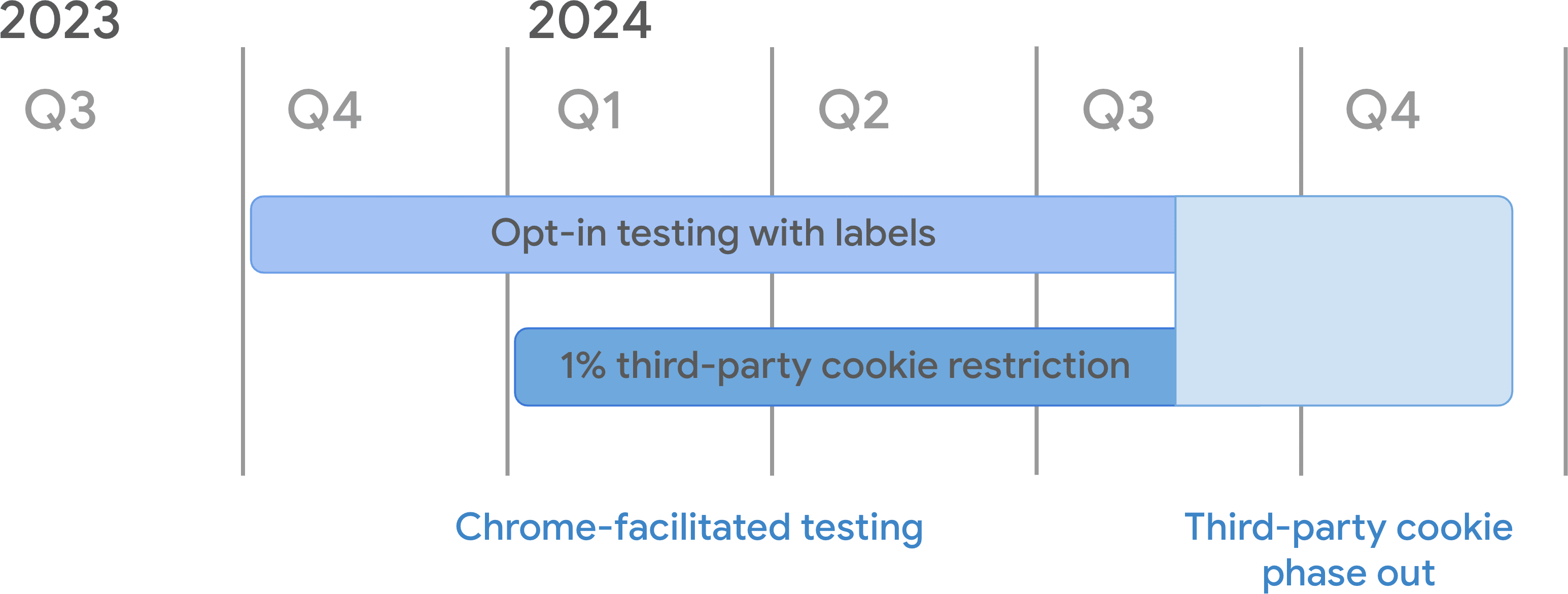
Your website might be utilizing third-party cookies, and it is crucial to address this issue as we near the deprecation of such cookies. In order to understand how to handle the impacted cookies, refer to the guidelines provided in the document titled Preparing for the end of third-party cookies. It is essential to take proactive steps to ensure that your website remains compliant and functions smoothly even after the third-party cookies are phased out.
The Checkbox feature has been introduced to address concerns related to third-party cookies. This feature includes a checkbox that is activated by default for all Chrome users. By enabling this checkbox, users will receive warnings in the Issues tab regarding the cookies affected by the upcoming deprecation and eventual elimination of third-party cookies. Users can disable the checkbox at any time to stop receiving these alerts. This proactive approach aims to keep users informed and prepared for changes impacting their browsing experience.
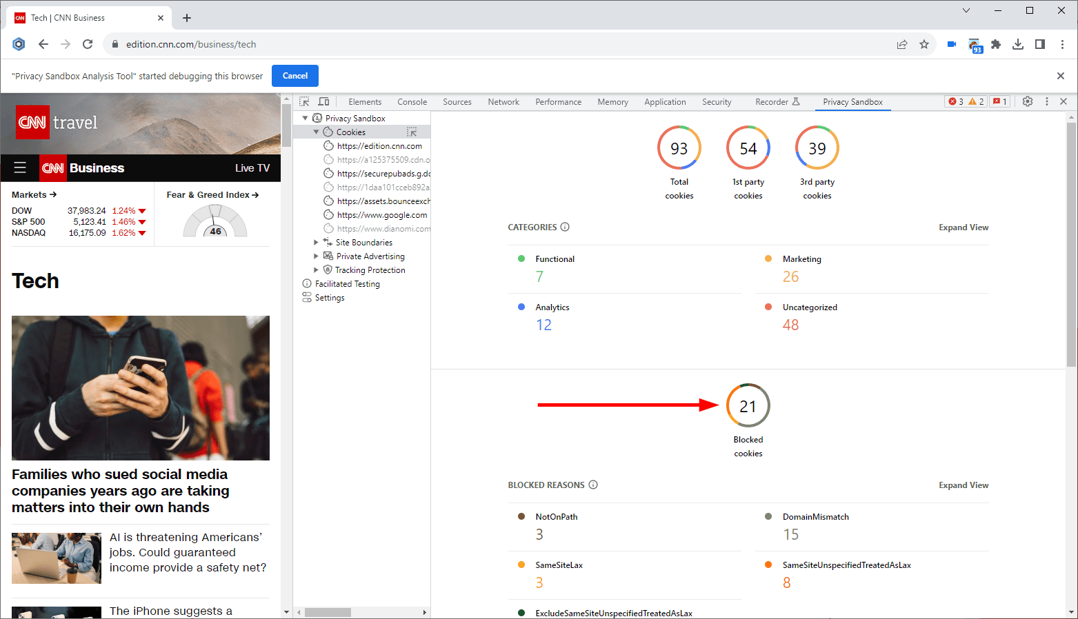
The Privacy Sandbox Analysis Tool extension for DevTools is being actively developed and is now available in the latest pre-release version of 0.6.0. You can install this tool in Blisk to gain insights into your website's cookie usage and get assistance in implementing the new privacy-focused APIs.