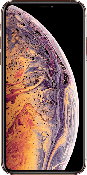
iPhone XS Max
iPhone XS Max is a phone powered by iOS OS and released by Apple on Friday, September 21, 2018.
Download Blisk application to test the cross-browser compatibility and responsive design on iPhone XS Max. This phone is ready to use standalone or simultaneously with lots of other popular devices.

Viewport Size:
414px × 896px Screen Size:
1242px × 2688px Device Pixel Ratio:
DPR 3Table of contents:
- Overview and Dimensions
- Screen size, Viewport & Pixel Ratio
- Key points for development and testing
- CSS Media Query
- Launch device in Blisk application
- Launch device from Command prompt or Terminal
- Specification (Summary)
Overview and Dimensions
iPhone XS Max was released by Apple on Friday, September 21, 2018 and is powered by iOS OS. By default, the device is shipped with a web browser — Safari for iOS. Device dimensions are 77.4×157.5×7.7 millimeters (3.05×6.2×0.3 inches)1. The device weighs 208 g.
iPhone XS Max has a Super Retina OLED display with a 6.5-inch screen (102.9 cm2, 19.5:9 aspect ratio), and an approximately 84.4% screen-to-body ratio. The display is a touch screen, meaning that it supports touch events - interactions using a finger or stylus.
1 - Property is displayed as width × height × thickness.
Screen size, Viewport & Pixel Ratio
iPhone XS Max has a 6.5-inch screen with a screen size (resolution): 1242px × 2688px , 414px × 896px viewport1, and a CSS Pixel Ratio of 3.
1 - Property is displayed as width × height.
Screen size (resolution) is the number of physical pixels present on a screen.
Viewport or Viewport size is the number of software pixels (CSS pixels) present on a screen. Usually, viewport size displays as viewport width in pixels to viewport height in pixels.
Device Pixel Ratio (DPR) or CSS Pixel Ratio is the ratio between the physical pixels (screen size or resolution) and CSS pixels (viewport). Depending on device specification, one CSS pixel can equal one or mode physical pixels. Modern devices have screens with high pixel density resulting in the difference between screen size (resolution) and viewport.
Summary:
Screen Size (Resolution) = Viewport size × Device Pixel Ratio.
Viewport size = Screen Size (Resolution) / Device Pixel Ratio.
CSS Pixel Ratio = Screen Size (Resolution) / Viewport size.
Key points for development and testing
Before you start web development or testing, check that the web application supports a responsive viewport by using a viewport meta tag:
You can inspect this tag in the head section of an HTML document on iPhone XS Max right in the Blisk app. If this viewport tag is missing, the web application will not be responsive and will overflow the screen, hiding the content from users and leading to a bad user experience.
The form factor of the device represents its primary orientation as a portrait. Landscape orientation is popular on iPhone XS Max as well and should be seriously considered when you develop or test web applications on any mobile.
You also need to consider that the users will manipulate your web application on iPhone XS Max with a finger and stylus because this device has a touch screen that supports touch events. It is important to remember, that users may interact with multiple fingers (multi-touch) and gestures: single tap, multi-tap, swipe, pinch, stretch, zoom, etc. The users are highly likely to use gestures on small touch screens because of seamless interaction and great user experience.
CSS Media Query
Use the CSS Media Queries below to apply custom CSS properties for iPhone XS Max and devices with the same screens:
iPhone XS Max Media Query for min-width:
iPhone XS Max Media Query for min-height:
iPhone XS Max Media Query for landscape orientation:
iPhone XS Max Media Query for portrait orientation:
iPhone XS Max Media Query with device pixel ratio:
Launch device in Blisk application
iPhone XS Max is ready to use in the Blisk app, where you can develop web applications and test cross-browser compatibility, use this phone as a standalone device or simultaneously with other devices. Getting started with Blisk...
- Download the latest version.
- Launch the Developer Mode from the Toolbar (screenshot below).
- Click Device Manager (screenshot below).
- Select iPhone XS Max from the list.
- Click Launch Devices.
Launch device from Command prompt or Terminal
You can launch iPhone XS Max in the Blisk app from Command prompt (Windows) or Terminal (macOS or Linux) to develop web applications and test cross-browser compatibility on a standalone device or simultaneously with other devices. Learn more...
- Download the latest version.
- Launch the Developer Mode from the Toolbar.
- Click Menu: Device Set ➜ Share Set.
- Select Command and click Next.
- Copy the generated command.
- Launch Command prompt or Terminal, paste the command, and execute it.
Specification (Summary)
| Release Date | Friday, September 21, 2018 |
| Vendor | Apple |
| Device Type | phone |
| Operating System | iOS |
| Display | Super Retina OLED, 102.9 cm2, 19.5:9, ~84.4% screen-to-body ratio |
| Screen Size (Resolution) Width | 1242px |
| Screen Size (Resolution) Height | 2688px |
| Viewport Width | 414px |
| Viewport Height | 896px |
| CSS Pixel Ratio | 3 |
| Display Size | 6.5-inch |
| Pixels Per Inch | 458 PPI |
| Dimensions (mm) | 77.4 mm × 157.5 mm × 7.7 mm |
| Dimensions (inch) | 3.05 inch × 6.2 inch × 0.3 inch |
| Device Weight | 208 g |

iPhone XS Max
is ready to use for
web development, testing, marketing, SEO needs
App for Windows, macOS, Linux
With Blisk app, you can:
- Develop responsive web applications for mobiles, tablets, and desktops
- Test cross-browser compatibility for mobiles, tablets, and desktops
- Test touch events, simulate medium or slow Internet connection
- Debug and measure performance with Developer Tools