Cross-Device Testing
Done Right
Used globally from the freelance segment to the enterprise level, Blisk helps IT professionals develop and test modern web applications in half the time and never miss any issue
Free trial. No credit card required.
Current version: 25.0.115.28.

Trusted by 125,000+ users.
Blisk powers web development in leading companies:


100 Devices. Ready to use
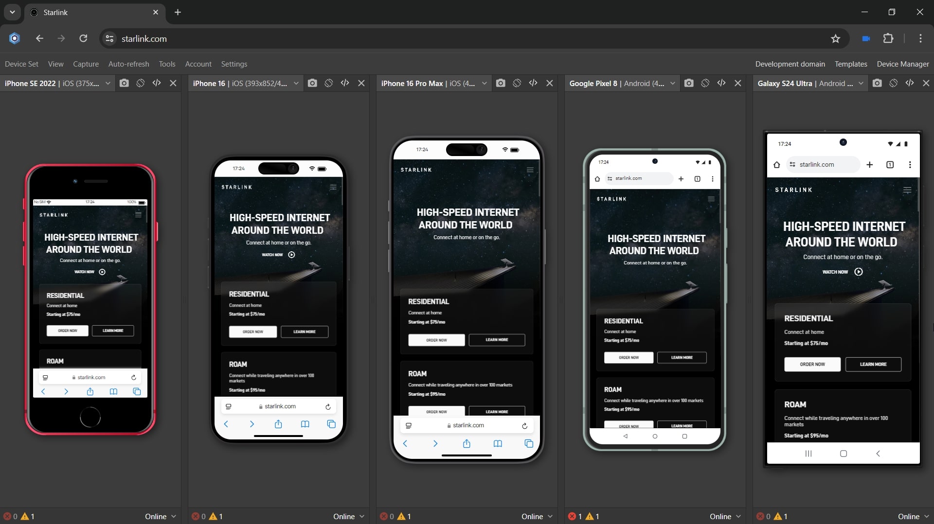
100 devices are integrated into Blisk. You can use mobiles, tablets, laptops, and desktops both standalone or multiple simultaneously.
When multiple, devices automatically follow each other by URL and scroll position. As a result, you work with the same portion of code across all opened devices.
Device OS: iOS, Android, iPadOS, macOS, Windows.
Vendors: Apple, Google, LG, Samsung, Dell.
What you can do with devices in Blisk:
Develop and test for mobile and desktop simultaneously. Top devices ready to use
Simulate medium or slow Internet connection, same as in real-life conditions
Test dark color theme as if your user would launch night mode on mobile
Create, save, and reuse custom device sets. Share device set with your team
Test support for touch events for web applications on mobiles and tablets
Display devices in real size - just as your web app will look to the end user
Track page errors and warnings on each device with a built-in Error Notifier
Test how your emails look in Gmail or Outlook on mobile and desktop
Test reactive single-page applications with custom navigation on mobile and desktop
Test both portrait & landscape orientation on mobiles to cover all use cases
Debug and measure performance with DevTools on each device independently
Monitor the website's rank or Ads on Google search results for mobile
Development and Testing made easy
Blisk enables you and your team to be more productive, faster,
and collaborate without switching apps.
Side-by-side View
Place devices next to each other and compare the UI on mobile and desktop simultaneously. Avoid making mistakes while working on responsive markup and styles.
Work with the same portion of code across all opened devices by using built-in URL and scroll sync. Devices follow each other by URL and scroll position. You only point the direction - Blisk does the rest.
Page Auto-refresh
Page Auto-refresh keeps the code updated to the latest version across devices. Web contents refresh automatically when you modify source code and save changes. If needed, the CSS can be updated asynchronously without refreshing the page.
You decide which file types and file locations trigger Auto-refresh. Auto-refresh delay may be handy for complex projects with bundling or preprocessing.
Error Notifications
Thanks to the built-in error monitor, you will immediately detect issues when you execute a new piece of code in Blisk. The sooner you identify an issue, the easier it is to fix it.
Blisk monitors for page errors in JavaScript and resources that failed to load in real-time. The user is notified when the issue appears on any device.
Screenshots and Recorder
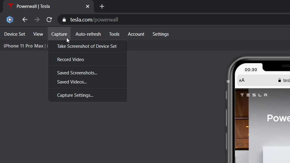
Take screenshots or record videos with automatic upload to our secure cloud storage. Share saved assets with your team or attach them to your bug reports.
Use the built-in image editor to highlight found issues or what's important on the screenshots.

Integrations
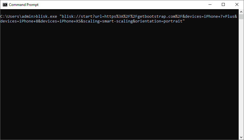
Need to launch Blisk from Command Prompt or Terminal? Blisk runs smoothly regardless of your OS. You decide which devices, URL, and device orientation will startup.
With Blisk URL Handler, you can launch Blisk from the address bar of another browser or directly from your Html content by replacing the link source with a Blisk link.

Why Blisk
Deliver responsive and high-performance web applications.

Develop
Prototype, develop and design responsive, high-performance web applications in half the time. Now you can work on mobile and desktop at the same time, meeting the needs of your customers.

Test
Check that your web application looks great and works fine on any device. Test mobile version on the same devices your end-user will be using. Simulate the the real-life conditions.

Collaborate
Collaborate effectively with your team. Share device sets, screenshots, and videos with teammates to take your web app to the next level and never miss any issues.
Users & Industries
Blisk is used by IT specialists from
different industries:
- Web Developers
- QA Engineers
- UI & UX Designers
- Marketers
- SEO Specialists
ITAutomotiveEducationFinancial ServicesEnergyGovernmentHealthcareManufacturingTravel & HospitalityReal EstateMedia & EntertainmentNonprofitPower & UtilitiesCharityE-commerce & RetailTelecomTransportationFood & Beverage