
Published on Friday, Sep 24, 2021
Author: Blisk team
Author: Blisk team
Blisk release 16.1.94.111
Mobile test on iPhone 13 mini, iPhone 13, iPhone 13 Pro, iPhone 13 Pro Max
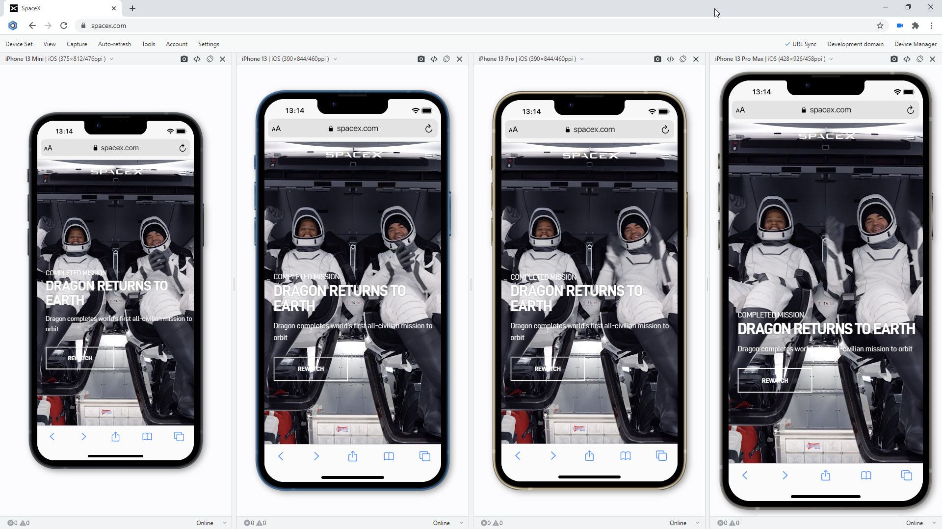
We are excited to release the new features: Mobile test on iPhone 13 mini, iPhone 13, iPhone 13 Pro, iPhone 13 Pro Max.
Important: learn more about new workflow in our new Getting Started Guide.
New devices in Blisk
iPhone 13 mini, iPhone 13, iPhone 13 Pro, iPhone 13 Pro Max are ready to use in the Blisk app, where you can run a mobile test, a responsive test, or a cross-device test. These devices are preinstalled in the Blisk app, so you don't need to download or install anything other than the Blisk app. The latest iPhones run directly on your PC, Mac, or Linux, and the code runs locally, avoiding potential data loss or security issues.
Requirements: this feature is available in Blisk v.16.1.94.111 and later. You may need to update Blisk application to use this feature. View Documentation.
Starting with v.16.1.94.111, Blisk opens new possibilities to running different kinds of mobile tests on iPhone 13 mini, iPhone 13, iPhone 13 Pro, iPhone 13 Pro Max: responsive test, multi-device test, touch events test, performance test, landscape orientation test, dark mode test, test for page errors, slow Internet connection test, etc.
How to run a mobile test on iPhone 13 mini, iPhone 13, iPhone 13 Pro, iPhone 13 Pro Max:
- Download Blisk or update to the latest version.
- Launch the Developer Mode from the Toolbar (screenshot below).
- Click Device Manager (screenshot below).
- Select iPhone 13 mini, iPhone 13, iPhone 13 Pro, iPhone 13 Pro Max from the list.
- Click Launch Devices.
What mobile tests you can run on iPhone 13 mini, iPhone 13, iPhone 13 Pro, iPhone 13 Pro Max in Blisk:
Responsive test:
Test whether your website supports responsive design and looks great on the latest Apple mobile devices. Such a mobile test will help to find issues with the responsive layout and issues with user experience on mobile devices. So now you can test responsive design on iPhone 13 mini, iPhone 13, iPhone 13 Pro, iPhone 13 Pro Max and compare the layout with laptops, desktops, and iPads.
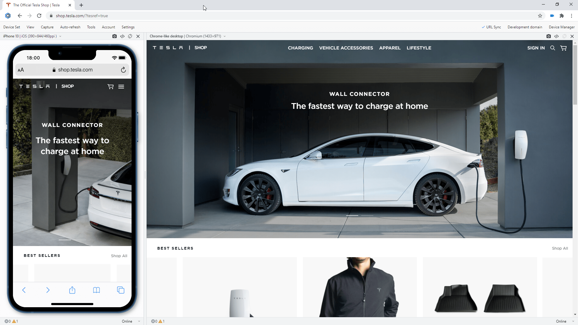
Blisk release September 2021
Multi-device test:
Test your new iPhone or use it with other devices such as other iOS and Android mobile phones, iPadOS tablets, Windows and macOS laptops, and desktops. When you use mobile and desktop at the same time, you are running mobile test and desktop test simultaneously. It becomes much easier to compare devices side-by-side. Starting with version 16.1, you can test on iPhone 13 mini, iPhone 13, iPhone 13 Pro, iPhone 13 Pro Max simultaneously with other devices.

Multi-device test on iPhone 13-series
Touch events test:
Check if your website supports touch events and gestures on the iPhone 13-series. Touch is a key element in any mobile test because all interactions on mobile are done using touch. iPhone 13 mini, iPhone 13, iPhone 13 Pro, iPhone 13 Pro Max in Blisk support touch events and gestures natively therefore you can test them easily without the need to have a mobile device. In addition, you can use Developer Tools on each device separately to track touchstart, touchend, touchcancel, or touchmove.
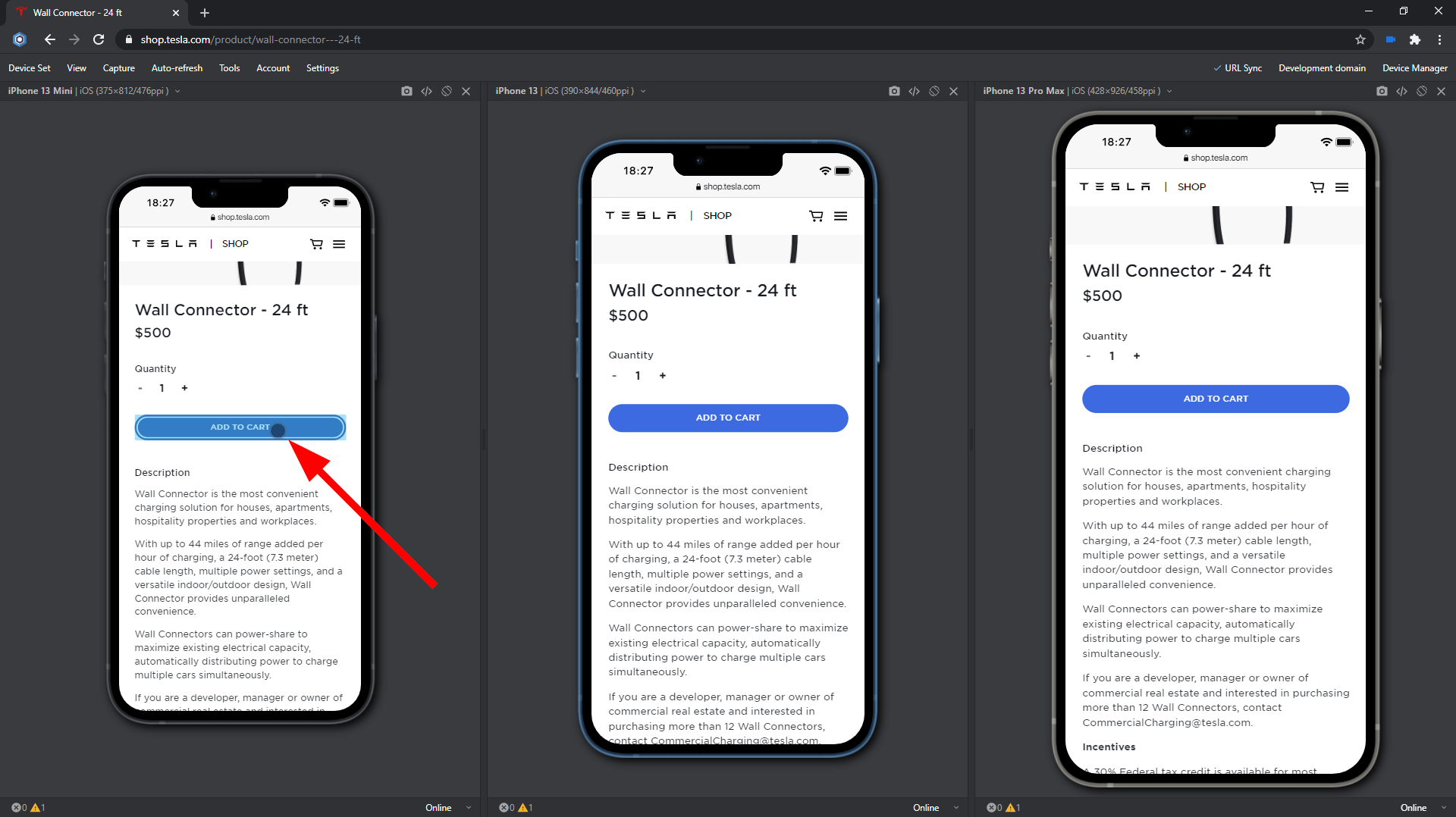
Touch events test on iPhone 13-series
Landscape orientation test:
Test how your website behaves in a landscape mode on the latest iPhones. Landscape orientation helps to find issues with layout and user experience. iPhone 13 mini, iPhone 13, iPhone 13 Pro, iPhone 13 Pro Max in Blisk have an option to change the orientation with just one click providing the users with a clear vision of what happens on mobile phones of the end users. Despite the fact that portrait and landscape orientations differ only in that the viewport is rotated 90 degrees, their differences in size are significant. Usually, this difference is overlooked but causes issues for your users on mobile.
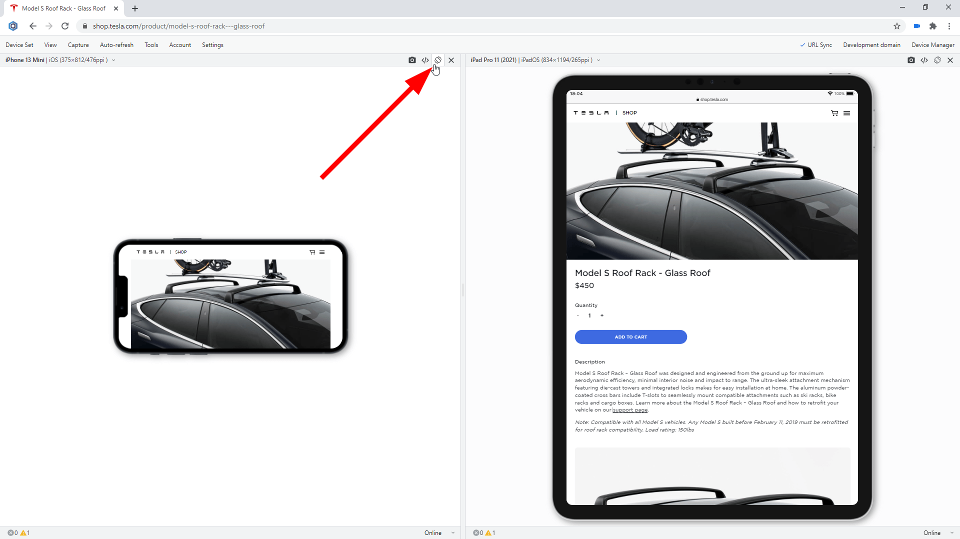
Landscape orientation test on iPhone 13-series
Developer Tools:
Inspect and debug your website with Developer Tools that can be run on any device. In Blisk, you can run Developer Tools on a per-device basis. This way you can use DevTools on iPhone 13 mini, iPhone 13, iPhone 13 Pro, iPhone 13 Pro Max at the same time. With Developer Tools, you can inspect the contents of a webpage, track webpage errors, check network requests, and solve other development-related issues.
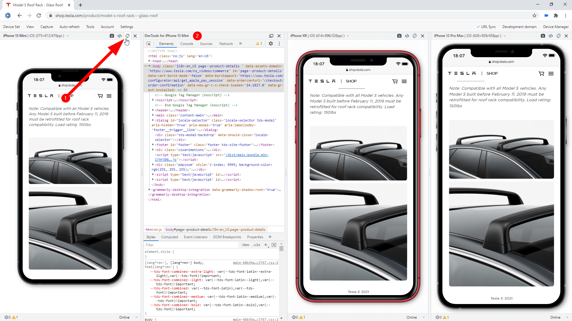
Using Developer Tools on iPhone 13-series
Test for webpage errors:
Monitor for webpage errors that appear on the latest iPhones and fix the issues before they become critical. The errors on mobile devices may be different from errors on desktops. Starting with version 16.1, you can track in real time JavaScript page errors and resources that failed to load on iPhone 13 mini, iPhone 13, iPhone 13 Pro, iPhone 13 Pro Max.
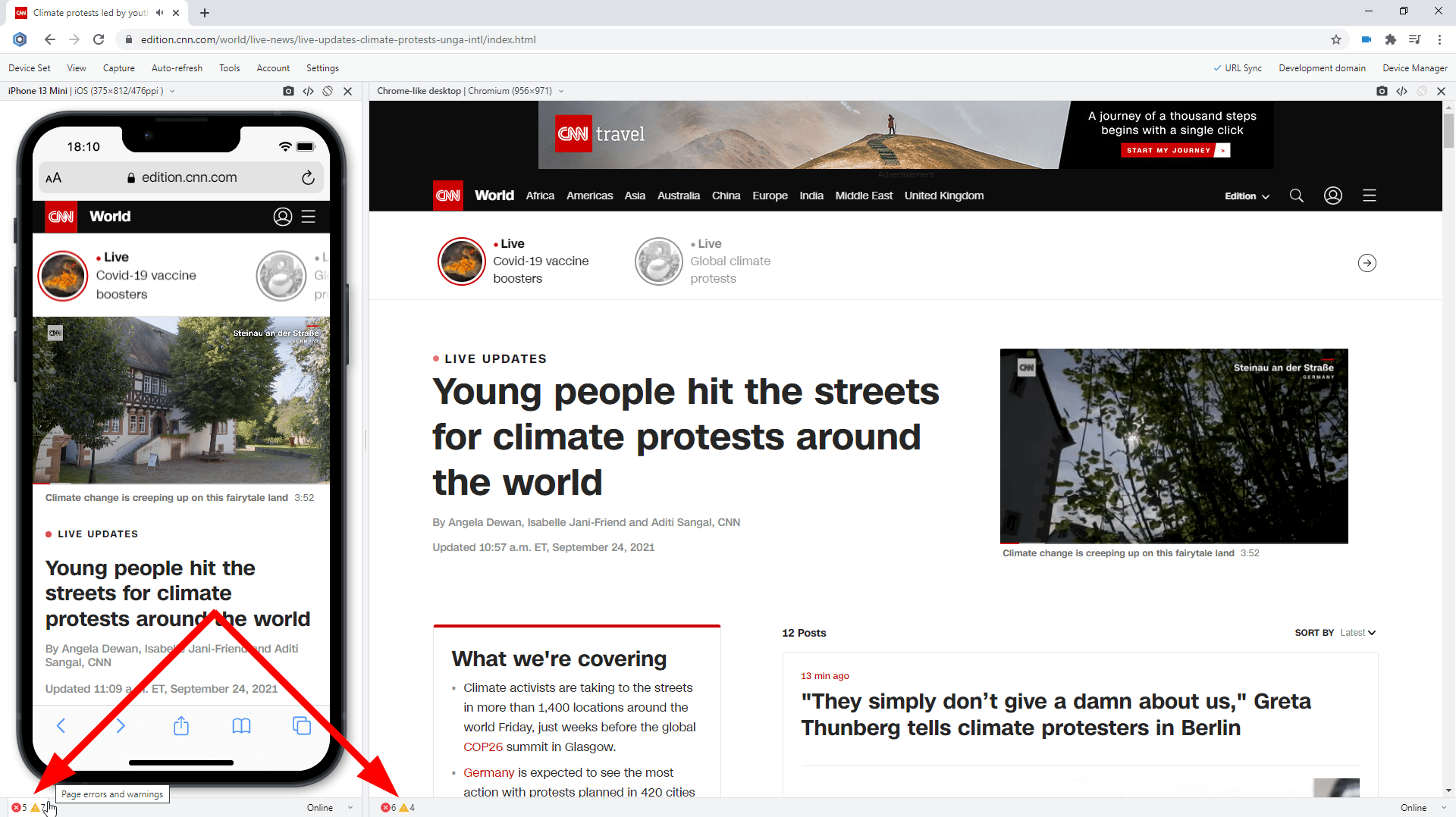
Test for webpage errors on iPhone 13-series
Performance test:
Run mobile tests in terms of webpage speed and performance. Webpage speed is critical on mobile, low speed leads to loss of users. Use the Network tab in the Developer Tools to conduct this important mobile test. This test is now available for the latest iPhone 13-series.
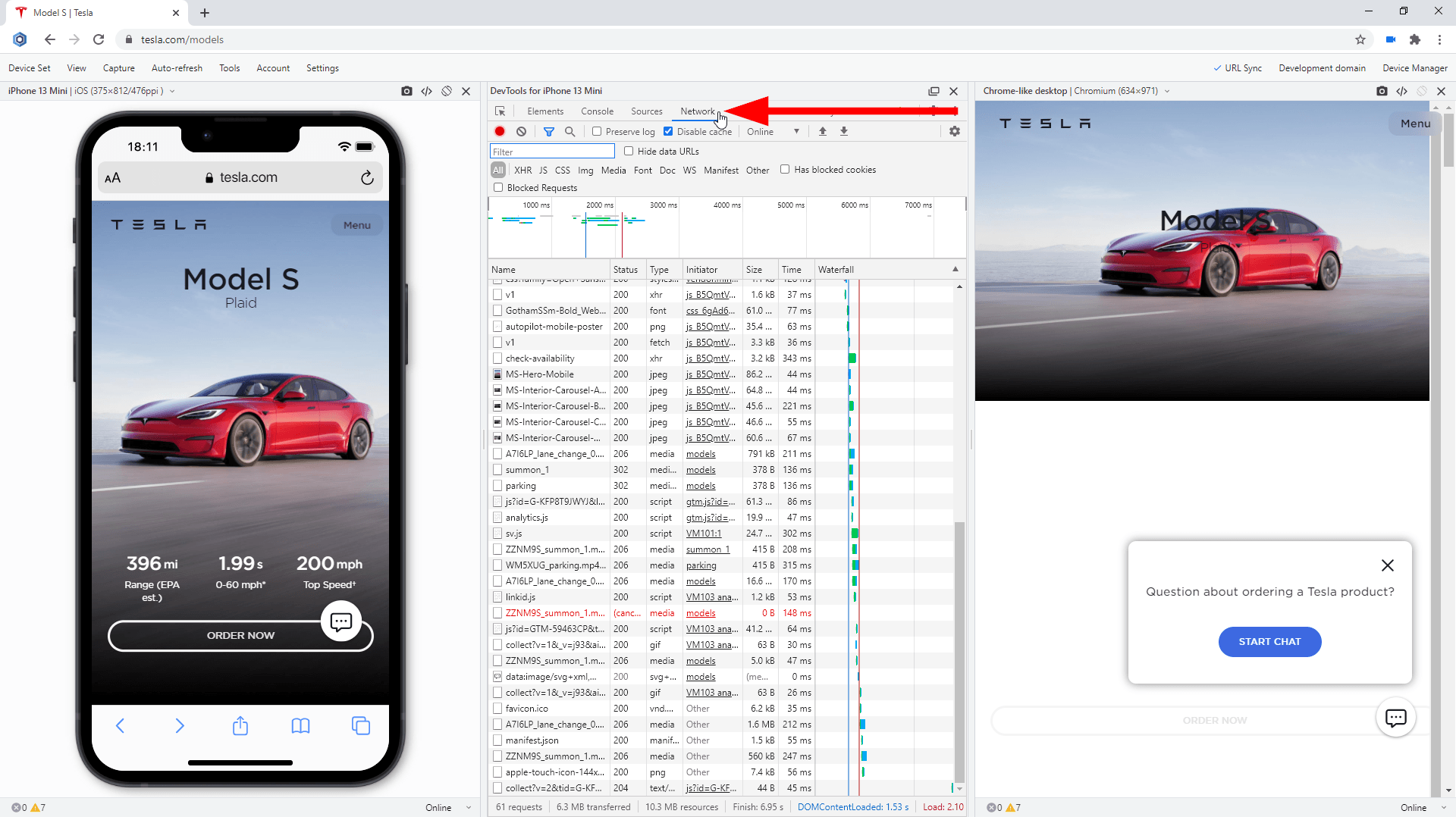
Performance test on iPhone 13-series
Dark mode test:
Check whether your website supports the dark mode on the brand-new iPhones by running Blisk in dark mode. A lot of mobile users prefer using the dark mode at nighttime. That is why the support for dark mode has become a must-have for modern applications. By enabling dark mode in Blisk, you can simulate dark mode on the latest flagships from Apple and check if the UI works well under night lighting and check the contrast.
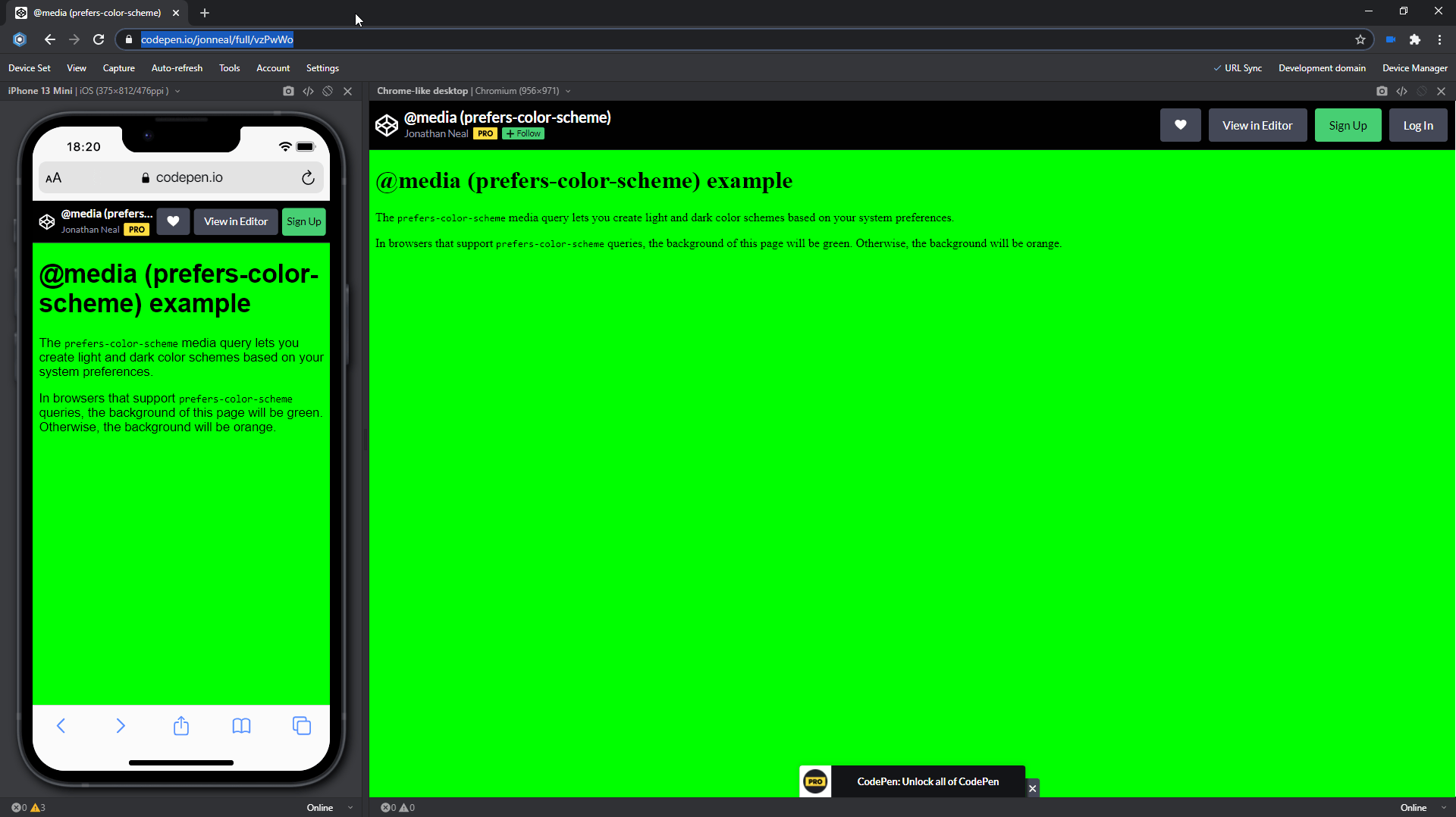
Dark mode test on iPhone 13-series
Slow connection test:
Simulate other real-world conditions on the latest iPhones, such as a slow internet connection. In Blisk, you can simulate 2G, 3G, 4G cellular networks with Internet speeds that differ significantly. The Slow 3G setting will help you run a custom mobile test and find the resources consuming all the bandwidth on the iPhone 13-series. In addition, you can adjust the network speed on each latest iPhone differently and compare the results across a set of devices.
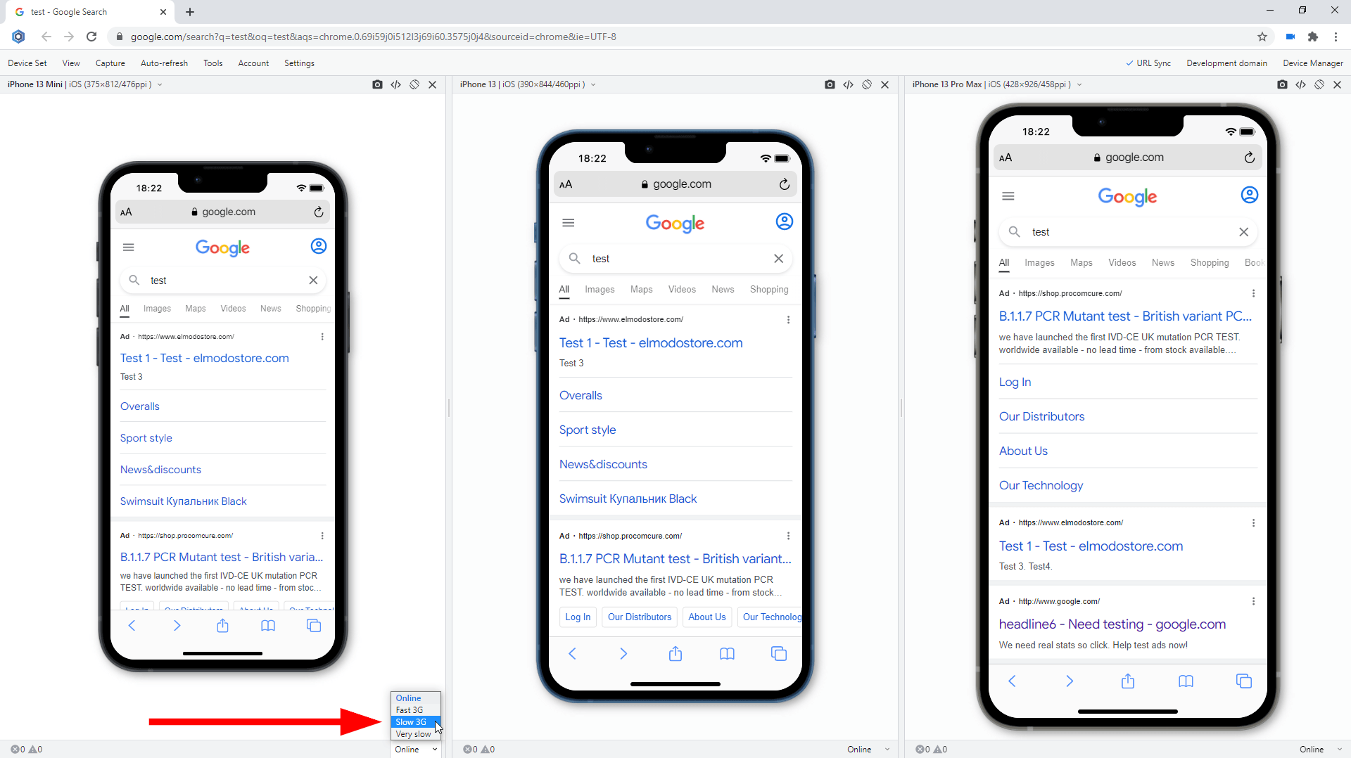
Slow connection test on iPhone 13-series
Usability test:
Test the user experience on mobile devices, uncover problems in the design, discover opportunities to improve the design, learn about users' behavior and preferences.
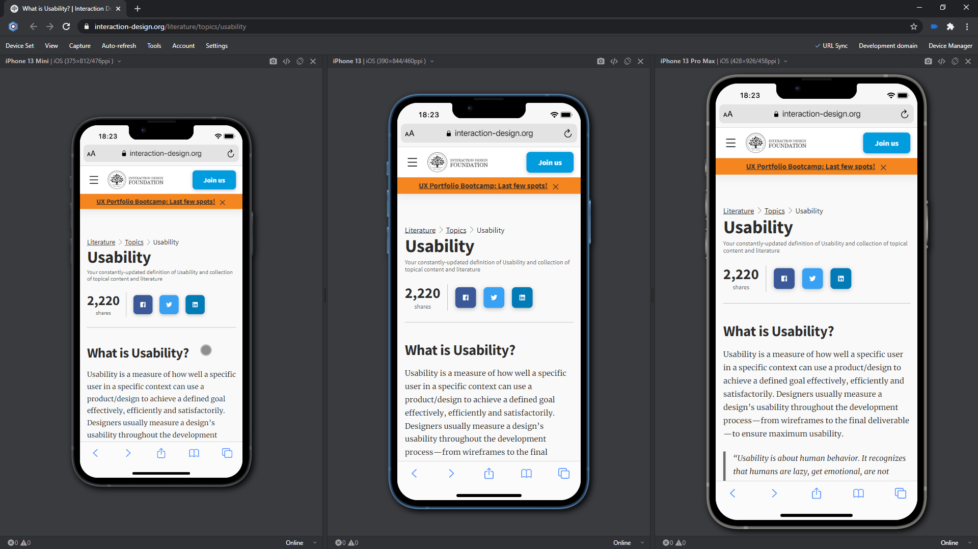
Usability test on iPhone 13-series
Test with your teammates:
Starting with version 16.1, you can share device sets with the latest iPhone 13-series via Blisk link (use Menu ➜ Device Set ➜ Share Device Set). Your teammate can launch the same device set and run the mobile test on the same URL and settings.
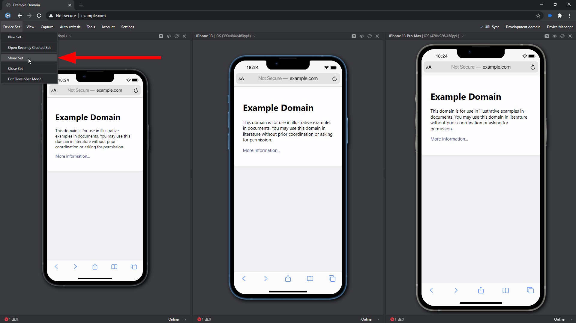
Test with your teammates on iPhone 13-series
iPhone 13-series Screen size, Viewport, Pixel Ratio, CSS Media Query, and specification
The specifications, viewport size, screen size, pixels per inch (PPI), CSS Pixel Ratio for new devices is available on the Device portal, where you can find the device metrics for all devices including the latest iPhone 13-series:
Learn the basics of using Blisk:
Learn more about Developer Mode, Development Domain, and Device Manager on Blisk Documentation.
Article tags:
BliskbrowserreleaseiPhone 13 miniiPhone 13iPhone 13 ProiPhone 13 Pro Maxmobile testtest