Published on Monday, Jan 4, 2016
Author: Blisk team
Author: Blisk team
Devices in Blisk browser
The story of building device emulation inside Blisk browser

While our team is coding the new features of Blisk browser - it's time to tell you about the device emulation in our browser.
Device emulation
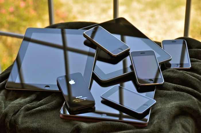
We have nine phones and four tablets today ready to use inside Blisk browser. Among phones, you can find the top rated trademarks, like Apple, Nokia, Samsung and Google. Regarding tablets, today we have two iPads and two Nexus tablets.
Supporting mobile devices and tablets has become crucial for almost every website. Bootstrapping websites in a usual browser like Chrome is possible for the single type of device.
Device content
In Blisk browser, the user can manipulate multiple devices simultaneously. Except the ordinary desktop view, we have added the extra content, which is located between device panel and ordinary web view. Device content is a container for every device chosen by the user.
The device content can easily fit any requirements of a monitor and user preferences. But using Blisk browser on a big HD monitor becomes really cool - as the user can set the enough device width. This is how tablets can resize to their real sizes.
We made all devices to look flat. This does not distract the user from the device's screen and makes everything look more natural as if iPad was standing right in front of you.
Device touch
Devices have a touch screen in Blisk. Hovering over any device shows touch cursor. Blisk in current version also supports touch events, like touch start, touch move, and touch end. This means, that the user can scroll the device as if he was scrolling on his personal phone.
Learn the basics of using Blisk:
Learn more about Developer Mode, Development Domain, and Device Manager on Blisk Documentation.
Article tags:
GeneralBliskbrowser